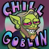
ChillGoblin
patreon

Help me pick a new logo! (Poll ends tuesday July 23 2024 at 5:52pm SHARP)
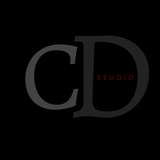
Had this idea for a Goblin-shaped logo and couldn't stop myself from "iterating" on it. I've narrowed it down to these four options. You'll notice they're all kinda similar, but also? They couldn't be more different.
Each one has a colour and a B&W version, so whichever option I go with, I can use either version in different contexts.
Have a look at them in high resolution too:


Time isn't wasted if something good comes out of it 😁 even if it's not the most important something 😅 I also deeply identify with replying to a message 15 days later ❤️
Yeah but which did YOU like best?
Welcome to the playful chaotic 13%
Yeah fair enough! Looking over the other ones I think you're right- was going for a pupil effect but it just becomes this weird ghostly dot haha. 2 is legible and stronger
Nice way of saying "wasting time when I have more important things to do"
I like 3 too haha. It was hard to let go of the goblin face idea but the people have spoken!
Good point! Everybody loves a cyclops
and fwiw option 3 reads the most like a goblin's face to me
option 2 is maybe the most "readable", but aesthetically option 3 is my clear fave!
I like the IDEA of the o and I, but on an implemented level I really just feel like option 2 looks the best Besides it has a cool like sans umdrrtale effect, unironically the 1 eye activated thing is asteically bad ass, like.in tf2 when demoman has a killstreak, or nick fury Just somthimg cool about 1 eye
I really like the look of the "o" in option 4, but the coloration of 2 is hands down the best. And the filled in dot on the "i" on 2 looks best to me.
Love the concept ❤️ And, as an ADHD graphic desiner I deeply identify with the "iterating"
I like the playful chaotic vibe of option 4