Karbo
patreon
Here are their pros and cons ( in my opinion ) :
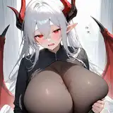
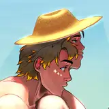
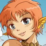
-the 3 is flat coloring, where colors are plains. It allows for a lot of clarity in a picture and a lot of details while keeping the picture perfectly readable, as each elements can be clearly separated. The Lineart is typically very strong and detailed, giving a lot of prevalence to the drawing itself. On the other hand, it can find limitations in the representation of depth, volumes and feeling it is able to convey, as lighting is often pretty basic. In short, it's an extremely readable, direct and efficient style but some might find it a little cold.
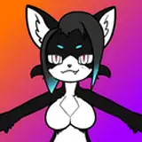
-the 4 is what I would call "Airbrushed flat coloring". The basis of the coloring is clearly flat but the shading on top of it is a little more diffuse. It's still a clear-cut style but it allows for more subtlety in depth and lighting than flat coloring. The coloring is less sharp as a result, though, and this style typically requires less strong lineart to work properly, making the picture just a little bit less readable overall than flat coloring. In short, you sacrifice some efficiency for more feelings in your picture.
-the 1 is a semi painted coloring style. The colors are applied with brushes but the lineart is still present, although it's more to highlight shapes than to give informations about volumes and such. It allows both a decent readability, and for the colors to convey a lot in term of volume and lighting. It's certainly a nice style but some might find it a bit too much "in the middle" and having the drawing and the painting coexist together can be difficult at times. In short, you trade more of the efficiency of your picture for more feelings.
-the 2 is pure painting : here the lineart and the drawing disappear almost completely for brush touches. It's a great technique when it comes to volumes and, above all, lighting. Because of that, a painting typically convey a lot feeling. However it's also clearly less readable than a flat coloring picture and having a lot of details in a painting is... tricky. it's extremely easy to clog up a painting with details if you are not careful as you have to hierarchize them and not give them the same amount of precision, depending on where they stand in the composition. In short it's a style that will always create less efficient and readable pictures than flat coloring but in return those are pictures with a lot of feeling in them.
So what do you think ? ;)

As much as I love iridan...I like the mega naga. That and the costume party style. I still like them all but I prefer 4.
Definitely would like to see a wallpaper size pic of Anna in that style -wink wink-
that's true, the ideal would be to find a style with the right balance ^^
ok ^^
ok :)
hehe alright :)
haha you are right indeed :P I guess what I'm trying to find is a style that would manage to include a bit more of both worlds so to speak. I think for now I' m going to try a mix between 3 and 4 :)
Thanks for your feedback :) Well the 3 is indeed what I do mostly but I'm at a point where I'd like to see if there is a way to mix it with 4 a bit, in order to have more textured / slightly more painted surfaces. I feel it gives more characters to a picture :3
I see but still it's interesting, it shows for your the lineart is particularly important :3
Thank you for your detailed feedback :) Well I definitely won't abandon or specialize in a style ^^ ( although I do plan to do a mix of 3 and 4 for the next few pictures to come ). You are right they are all handy for different circumstances and each of them have their strength . But still it was interesting to see which one was preferred by most people ^^
I see XD Well actually think I'm going to try to have a sort of mix between the 3 and 4 in my next few pictures ;)
ok ^^ Well I think I'm going to try to have some mix with the 3 and 4 in my next few pictures :3
it's hard to say XD they all have their appeal. But I'd say I'm going to see about a fusion of sort between 3 and 4. Keeping a strong lineart but with more freedom on the coloring, perhaps with more textures and a slight painting. It's really a balancing act :3
Thank you ;) And no what you are saying makes a lot of sense :3 To me the ideal would be to manage to mix the style 3 with something a bit less "flat" maybe either more textured or slightly more painted. I'm going to explore that in the next pictures, I have a lot of ideas :)
My bad, it's corrected now ^^; and thank you for your feedback, I think I'm going to explore a bit toward a slightly more painterly style in the next several pictures I do :3
alright :3
ok ^^
Honestly, this will sound like a huge cop-out, but I really rather like them all. They all certainly have strengths and weaknesses depending upon what you're trying to do, but I expect you understand the nuances of that far better than me. But! If you're looking for this untrained layman's gut feelings (which skilled artists should probably ignore ;P): I tend to like 3 & 4 best for conveying cute and/or sexy characters, action and that sort of thing, while I feel 1 & 2 make for better atmospheric type pieces. I now realize I've probably kinda just reiterated what you already wrote above, but eh! What can you do? xD
I'll say this right now. Specialization in just one of your styles seems both unnecessary and wasteful. They're all Amazing. I say abandoning any of them as wasteful since they all help set different modes and tones. Let's start with the one on the left. It has a very realistic an natural overtone to the fantasy portrayed there. Living in a heavily wooded area the effect of the light being filtered by the trees and leafs is masterfully done. The Top Middle one portrays a Dark yet not too sinister overtone for the Demon featured, both foreboding and playful. The Bottom Middle one fits the theme of Royalty and Civility even among Demon royalty. Not too serious not too frilly and sets the right mood. The one on the right is bright and cheery which perfectly fits the playful scene. If certain styles are harder or easier then each other I'd advise you compare and gauge them on a personal difficulty ranking. And adjust prices reasonably to reflect. Or if money regarding commissions has nothing to do with the question keep a mental note to the vibes and traits of each style to help better pick the right style for the scene. Honestly the only criticism I can even make to you Karbo is that you explore more of the main world and craft more stories. Since your just as skilled at crafting delightful story driven comics as you are at soft vore artwork. However I think that's a sign of accomplishment when the only criticism somebody can think of is that they just plain want more.
Well, aside from number two, I like all of the styles. I honestly can't decide between numbers 1, 3 and 4.
I like 4 the best, a little hard to explain why, but I think 4 is the best balance, I think it has a lot of feeling, and I also think 1 and 2 are a little more detailed but don't fit a lot of your Felarya artwork emotionally
Just like the succubi picture "Subeta to the rescue" also is 3 ( the flat coloring) right ? So definitely this one ^_^. I like seeing all the details clearly which really worked out on this one (especially at 4k resolution soooo soooooo gooooooood *drool* ) . 1 is a close second though as (while not as overall in-depth) it also looks very good on upclose characters like Temi in this case ;-) . Not a big fan of pure paintings :( and while 4 seems to work really well on distant characters and environments I can't however befriend myself with the heavy brightness/blurriness that is introduced on the mega naga here (especially if such a striking character wouldn't be as far away) .
I think it depends on what you want to emphasize in a drawing. Numbers 1 and 2 (especially 2) are great in trying to emphasize atmosphere and mood of the drawing you'd to convey, that type of drawing won't work nearly as good if you want to emphasize a simple scene of people talking or emphasizing movement. 3 and 4 however, do that far more batter, but a landscape drawing won't look as good in these art styles as they would using 1 and 2. These are my 2 cents on the subject :)
People make mistakes it's fine, you're not dumb at all ^^ As far as style preferences go, 2 is amazing for the pinup style photos you do, and the maw shots. It just has a really soft and nice appearance to them, although It probably takes a while to do. 3 Is what I consider to be your usual style, and I like it a lot. I like that kind of... shinyness and linework? God I know nothing about drawing but it's a style I like in lots of things I see. Clean and neat and attractive to look at when it's depicting... attractive things >.> 4 isn't something I'm so fond of, but I'm not sure whether I would have seen it in other pictures and I'm just not recognizing it. And 1 is... Too dark somehow? It looks quite different to how you usually do things as well. That said I just enjoy seeing what comes out of this patreon of yours. I agonize over commissioning people for... well, ANYTHING, but with patreon I can just give to nice people and they get to make more nice things. And also once again I know nothing about drawing so if I'm saying confusing/contradictory things discard it without a second thought >.<
I prefer 4 honestly.
My preferences would be 2 and 4, but I've always had a weakness for very smooth and detailed pictures that seem to almost be real from the amount of care it is put in them. My "artist crush" history includes people such as Simosi, who's art is so detailed you could practically count the leaves in the trees if you had the time to, or recently RiceGnat, his lovely Ahris captivating me beyond measure. I would, though, like to redirect the question back to you. What style do you like best, Karbo?
Of those, I definitely prefer #4, with the Meganaga.
I really like all 4, but I'm more partial to 4. I really feel like these all have their own place though.
.. I'm stupid >> there it's corrected XP
Dang it I wrote a whole bunch of words but there's two styles labelled "4" and I'm both too inexperienced with art and too fuzzled in the head to identify which is which >.<
They are all great in their own ways but I prefer 4
the numbers in the description are confusing (there are two 4's) but I'll use the numbers on the images themselves .... I like 1 and 4 the best, they offer the best combination of clarity, readability, detail, subtlety, and I'm assuming time management/efficiency .... 3 has it's place, I think especially for comics, with clarity, detail, and lack of brush coloring as another step, but it does lose the level of feeling the others achieve, but that's the tradeoff of most comics in favor of increased content not masterpiece level art .... 2 is stunning, but I think the assumed increased in time spent to achieve such results is overall not worth it on a regular basis .... I think 1 and 4 offer the best of 2 and 3 in terms of style, detail, and time management
3 is good but I like 4 the most.
Each one has its own style/mood that it would work for, but I generally like 4 the most.