nerdcubed
patreon
- Dan
PS. Yes, the video needed fifteen different fonts. That's just the mood I'm in today.

aah 3 days now!
You've been replied to
Can you reply to me? I need a self-esteem booster :P
lol 2018
Reminds me of the Monster's Inc. logo
Very 80s.
Looks like the Sun logo
Are you going to update dad cube's logo to a similar style?
you missed the trick without having any elevator music
This might be a stupid question but is the dadcubed logo going to look similar ?
It's beginning to grow on me, definitley! But am I the only one who thinks the full version should be left-aligned when it's used? Like, for example, on the cover of a book it should be "attached" to the left hand edge, maybe near the top? IDK. Really starting to like it though :3
I'll be honest, not a massive fan. Of either the logo or the way in which you have targeted the subreddit. I'm sorry, but it just doesn't feel right to me.
On twitter you said no more series. But does that include the plays series
i really like the logo but i just feels a little off to me? hopefully I'll get used to it soon but idk
It took me a while to get used to but after seeing it on twitter every day I have grown to love it!
Yeah it needs to be more... CUBED :DDDDD
Hm... yeah, that reminds of Big Hero 6... but in my opinion, it's a bit too square... then again, I might just need time to get used to it.
It's Big Hero 6! I love it.
does this remind anyone of the heists logo or is that just me?
I saw that too.
did anyone else see the 2018 at the bottom. Dan you better be back this year
Dan that logo is horrible.
I love it I feel like it fits with the persona of NerdCubed and I can't wait to see the return.
Nerdcubed returns on my actual birthday. What an amazing gift.
i really love it. kinda fits with a dans style of content with the retro(ish) feel to it
Has a lot of potential and oddly reminds me of Marvel.. Dan you've been watching a lot of Marvel movies lately haven't you. >< :)
I like it! Its tough on people who grew used to a logo for over 7 or so years old at this point, but as one of those people, I grew to like the new one in about 5 seconds! Good on you, Dan!
Hmmm gotta say i'm not a huge fan of the three.
Looks as good if not better than the logo i've known for 4 years :)
Looks great !!!
Thank fuck for that... a September without dan would be like a September in hell. That's right, not a July.... A SEPTEMBER
love the new logo, v profesh
I have mixed feelings about it.... I like how it stands out and that not much of the logo has changed and it's got a old sonic feel about it. But I'm not a massive fan of the chunky letters and it looks just a bit too neat. All that being said I am very excited to see how this change goes and I'm glad that you're coming back refreshed. I hope everything goes well see you in 2018
I love it... And it s still red... So it goes FASTER!
So you got go faster stripes. Nice. I'll get you some fluffy dice.
i really like it, and in a wierd way it makes me thing of old sega games. The ONLY thing im not keen on is the way the 3 shapes, I think its the distance between the top two stave thats bugging me, it just doesnt quite scan as a 3 to me >.
I don't know why but it gives me very "Ready Player One" vibes
Returns 16th of September...................2018?!?!?!?!?!
solid 10
I just watched the new animation in 0.25 speed, I never realised the letters drop in first time round. IT'S SO GOOD I LOVE IT YOU WERE RIGHT
2018 xD golden
Are you not Entertained?
Sweeet
Not blowing my mind but having been watching you since the beginning I adore and recognise the original. More psyched to see what the new content is gonna be like. Are we going to see The Hulk version of what was Bruce Banner?
The 3 is how you display something as 'cubed' in mathmatic form :) at least that's what I hope you're asking!
fantastic mate :)
Getting lots of Big Hero 6 vibes from that logo. I'm ok with that.
cool cool cool.
2018? I think that was a joke. I like the new logo though. Very you.
What's with the 3? Liking it, but I preferred the old one. I love the new font with the word "Nerd" though. Snazzy! Can't wait to see more content, whether it's on Patreon or Youtube, new logo or not.
I love it!
On its own, I initially didn't like it. But once it was placed above the other text, the streamlined look of it really pops out. I reckon it will work as a cross-media logo. Nice work.
1... more... year....
September is in 2018???
How rounded, how professional! Excited for the return!
It's different. That's enough of a reason for me not to like it. But if it's what Dan wants then it's what we're getting. I'd be interested to know all the thoughts that went into making it though.
I like it a lot.
Was worried at first but I am now relieved. Looks great Dan!
It's gonna be like getting a new car... You miss the old one because of it's charm and character but this new one is all sleek and doesn't have that weird smell of some banANA PEEL YOUR DAD DROPPED BEHIND THE CHAIR THAT'S SLOWLY ROTTING AWAY.
Very nice Dan, can't wait for your return... whatever year that might be in. (You're pulling my leg again ain't you? The Ashens joke was bad enough..)
Looks like Roundabouts font
That's super neat. Nerdcubed is back and he's bigger than ever!! I think it's an improvement overall to be honest. Love it. Can't wait to see you back Dan
See you in 2018!
The three when it's smaller is harder to read, but overall looks good
HOLY FUCK IT"S AMAZING]
Ok first of all I have Aspergers and hate change, just wanted to give you all a reason to understand my point of view. Its not that I don't like the new logo as such its just that I look at it and See "Big Hero 6", I dont know why! Anyone else? XD
And... Where's the download?
I. Love. It
Looks amazing, has a really retro vibe to it I love it, that 2018 was just mean Dan
The old logo was softer and more inviting. Going to take a while to get used to the new logo, but I do have to admit its really COOL.
My eyes read it as NEW NERD CUBBED LEGO.... I thought he got his own Lego set
I like the concept, the sharp and clean straight lines and all, but I think it could do with a bit less "horizontality"/width/chunkiness, and a more symmetrical 3. Otherwise it's pretty good
Woohoo!! From the one person in Australia
Gonna take time to get used to the new look methinks. Still very cool.
It really cool
I'll support it completely but I don't know how I feel about it, it's a fantastic logo but I feel like it might not work well in the thumbnails and other places, if you can prove me wrong than that would be amazing. P.S. It kinda reminds me of the Marvel logo. P.P.S That's probably not a bad thing considering your origins.
Yes, very good
I'm unsure on this tbh, seems a little too simplistic (I think that's the word I'm thinking of) also seems like shortening it to N3 might not look as good on this one, but then again, it's your logo and I'm gonna support 100% regardless of what it looks like so woo rebrand \o/
It looks so smooth and neat
It doesnt seem as friendly and inviting as your old logo but it does have more of a professional look to it.
I’ve never liked bulkyness, so this will take me a while to get used to. The animation though is wonderful and makes the logo look way nicer. Edit: Having given it a few days, I’m starting to love it. Especially the IRL version. I guess the strong red made it a bit off-putting at first. The N³ one though, that for some reason you didn’t show here, is fucking gorgeous and I absolutely loved it from the beginning.
i see you got acquired by marvel
looks like nerdcubed cone full corporate and the 3 is really hard to recognise you could no also be nerd^7 or nerd^T
Woooooooo like it I dooooooooo
That video thumbnail made it look like the new logo was the same as the old one but with the "3" way higher. ;p I do like the actual new logo though.
Then God said, "Let there be Nerd3"; and there was Nerd3.
Looks great Dan! I think it's more of a corporate logo without being completely deprived of Danitude. Nice one.
We Marvel now boys :P
I'm quite fond of the new logo. It's very Gamesy, even if that isn't a work. It reminds me of something you'd find of a game, which I suppose is the point.
Love it! Somewhat sonic esque, stylish, simple, other adjectives that begin with an s...
Oh, you've redecorated! I don't like it :P
2018...
Have fun on your year off! looking forward to September 16th (next year)
I have mixed feelings of this logo. The old logo was more you. It wasn't as serious and told a story that you didn't care about who you where, and a bit childish. The new seems in a way boring and corporate looking. But, What do i know about graphics design anyway?
I like it! I instantly thought Sonic the moment I saw it, have you been playing a little too much while doing logo design?
Pretty cool, kinda retro yet modern, very nice.
I definitely like the old one better, but I don't come here to see your logo. I come here to see you. As long as you keep being you I won't be going anywhere anytime soon.
Beautiful! I love the animation too! My only gripe is the red outline is very hard to see when the logo is small at the end, I'd make it a tiiiiny bit thicker!
Well, I don't outright hate it, which is good. It'll grow on me.
You return 3 day's before my birthday, that will be a great early birthday present P.S. really great logo P.P.S. I really like and appreciate change, is that weird in any way?
So modern! So techno.
Oooh, nice! It's gonna take a bit to get used to the new logo after years of the old one, but that's pretty sweet
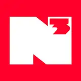
So the shortened "N³" version would look like this right? <a href="http://i.imgur.com/hBSxLPe.png" rel="nofollow noopener" target="_blank">http://i.imgur.com/hBSxLPe.png</a>
Fuck it, upgrading to 5 dollars a month. hahahahaha don't need food, need the nerd^3.
HALLELUJAH!!!
I dig it!
Amazing!
Wait. 2018? You're definitely kidding us!
The email didn't show it was a video. So all I had was a picture of your old logo and the caption, "IT'S HERE! IT'S NEW!" I was like...Dan? You haven't changed anything 😂 I'll try reading the whole thing next time.
Oooh
It's so smooth and sophisticated. who are you and what have you done with the real nerdcubed -.-
I see where you were going with it, allowing it to be more friendly for other things not just youtube.
I also really love the animation of the logo. Every slight detail of it. Great job.
David Tennant Approves!!
I like it Dan, been watching for 4-5 ish years, but the logo doesnt make nerdcubed, you do! I still use a line you said in a video ages ago. "Off is a direction in which you should piss"
I like it . How many iterations did you go through to arrive at this?
But away from me trying to be your mother to get you to calm down, the logo looks great!
DAN' S SHOUTING ALOT
Fuck it. I've changed my mind. I love the new logo!
you are kidding us, right?
NEVER! (ok)
I AGREE
it's better than the new patreon logo
HOORAY!
MAYBE
Great new logo Dan. I love it!!
DO
Love the new logo! And stop commenting on your own post, you madman.
THANKING YOU
I AM HITTING IT! IT IS YOU WHO IS READING WRONG
we're happy if you're happy, dan
Calm down!
I AM THE FAN BOYEST
STOP LOOKING AT ME, LOOK AT THE LOGO
Dan, step away from the keyboard/phone.
SOMETIMES YOU HAVE TO KILL AN OLD FRIEND TO WIN AT PROFESSIONAL
SHHHHHHHHHHHHHHHHH
NOOOOOOOOOOOOOOOOOOOOOOOOOO
Definitely like this one better
WHY, WHAT HAPPENS THEN?
Hey that's my brithday too!
\o/
THERE ARE NO VARIATIONS. THIS ONE KILLED ALL ITS FRIENDS
It's a shock as a long time subscriber and patreon supporter but I actually like this difference.
YOU ARE AMAZING
Have you had too much sugar?
I KNOW RIGHT!
Dan i cant wait
GROW IT SHALL!
IT'S AS SLICK AS AN ICY ROAD THAT YOUR GRANDMA FALLS OVER ON!
New logo definitely good! Oh and yay on my birthday! :D
Looks great Dan!
MY INSPIRATION WAS THE TIME THAT IS NOW!
GOOD!
WITH ALEX HORNE CAMEOS! (NOT REALLY)
thank you
Dan, you do know there's a reply button right? Because I have no idea who your talking to. It looks like youre just screaming random things at the tip of your lungs. Though that is your job I suppose lol
BUSINESS BUSINESS BUSINESS!
YOU MISSED THE 2022 THO DIDN'T YOU?
I COULD DO THAT NEXT WEEK!
THE OLD ONE DID DRUGS AND ABUSED CHILDREN
Dan commenting on his own post like a fanboy, makes me think he is going crazy
ADMIT IT!
YES!
ALLONS Y!
IT LOVES YOU!
That is f*****g sexy 😍😍
YOU DO! I CHECKED!
HOORAY!
Looks great. I still kind of prefer the old one but this one looks very professional:)
DANKE
IT'S FAT, WHITE AND FILLED WITH AIR! JUST LIKE ME!
2018??! I saw that flash up
I'll have to get you a second Pop figure now..
SHHHHHHHHHHH
I like it. I feel like the other one had more charm to it but this one is nice as well. Can't wait for 16th November!
I'LL YELL IT AT THE START OF EVERY VIDEO
YES!
Whoa. I was trying to not expect anything, but that is totally not what I expected. Can't wait to see all the variations.
SO AM I!
IT IS AMAZING!
Well, that sure is a logo!
WE SHALL
BRING IT ON SLOWLY I HAVE A LOT TO DO
It's different, for sure. At first glance it looks ok. I neither love it, nor hate it - probably grow on me 😆
It looks awesome! It suits the new, one video a week quality over quantity thing you're going to be doing for sure! :D so very slick!
DRUGS WERE INVOLVED YES
YES!
Looks much more Modern
I am prepared to endure the wait for your return next year.
Same week as the next season of Taskmaster begins. Woo.
THIS LOOKS GOOD I APPROVE
NO YOU ARE!
SIX SECONDS
OH?
I'LL TAKE THAT AS GOOD
YEAH BABY
It's really nice! Looks a bit less personal, and more like a buisness, which I suppose it is, but still, I'll grow to love it, I'm sure! 😊
SO ARE YOU! \o/
my reaction time is too superiour to miss the "2018"
I like this logo but I'd love to see all the ideas you went through to get to it.
WILL SMITH DESIGNED IT
I LOVE JUMPING QUESTIONABLE BARS!
I'M HERE FOR YOU
I AM THANKS HOW ARE YOU
I LOVE YOU
It looks too sleek. The old one felt like it had more character/fun
I got way more excited than I care to admit :)
I can see this going on books and game covers more than the old one. I like it
Oh you've redecorated... I don't like it. (I actually do (I also saw that 2018 pop up you sly bitch))
Maybe I still need to warm to it but I don't love it
Pretty far from what I was expecting.. but I think I like it? .. Also that new animation to reveal it is the best thing about it :o
I had worked myself up so much to hate the new logo before I had even seen it because I loved, and was so used to, the old one...but I really like it, like a lot more than the old one...great job!
very nice
Reminds me of Big Hero 6. Also, I saw that cheeky 2018. I hope that you're just messing with us (because I'm not sure YouTube will even be left to burn to the ground by then)
2018 flashed up there. Messing us about maybe.... hopefully.
Anyone else get major SEGA vibes or just me?
It's a bit more sensible than I expected XD
I like it, you need to update the merch though!
Looks good, fresh! Bring on 16th September
Nice logo. I assume there's a smaller version for avatars and such too?
That is pretty dope
Beautiful
Much more sleek, I can see where the diversification part you spoke of came into the design. How long do I have to buy old N3 logo merch tho?
oh.
Not bad
damn new logo is thicc, i love it
It's... Very... Unique?
Think it looks "Fresh"
I don't know what I expected, but this surpasses it
I'm here for this
ok
dude i love it