solargirlasmr
patreon
Heyyy ✨ I'm at a crossroads again, who wants to help me out?
Let me know in the comments which one looks better: 1💚, 2❤️ or 3💗.
A little bit of context here: this character is going to have that darker mysterious vibe 🌫️👀
As usual, the text part is still subject to change, and I might even switch between thumbnails after the video is uploaded, depending on its performance... but of course I'd love to know what you think! After all, the last time I trusted your opinion my views have been through the roof 😱🎉 Thank you so much for your input, you're absolutely the best!
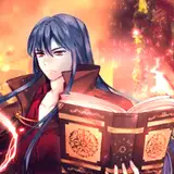
Beautiful character art by zeronis 🎨

I hope it works out well 🙏
Aww thank you 😇
Oh, I actually understand what you mean, will try doing that. I really like how highlights are kind of popping in the first one, although red looks very eye catching as well. Will try combining these two if I can and see how it turns out, thank you! 🙏
the top one, I think the character and text has a nice contrast
I think the 3rd one pops out the most because of the contrast and would get the most clicks💗 Although If I was to be picky, the darker ones match the character better and that might have more watch time. Maybe you could try a gradient from the bright part of her hair to the red on her clothes or some variation of that? No clue how it would actually look though
I think number 2 has that darker dominant aura, perfect for the charachter! :)
It's number 2 for me
3! 👌🏻👌🏻👌🏻
💚💚💚
Number one really makes the red on your outfit pop.
Personally, option 3 is my favourite, because I love purple with blue (it’s the purple), but both of the other two are more fitting. The green and purple are almost “sickly”, as if we’re meant to feel uneasy, and the red is menacing. However, option 2 seems to be the obvious favourite.
Black and red is my fav color combo, so my pick is #2. But the contrast and popping out of 3 is a close 2nd pick for me
2 Having a color scheme that matches the characters overall color is generally the best choice as well as the dark red fits with the dialog as well, 1 would be second and 3 doesnt match the character nor the dialoug well.
Numba 1 pls. "Oh no pls pls be nice to me" grins devilishly XD
This
Number 2 seems like the best fit for the vibe you're going for. The red background also goes nicely with the red in the character design.
Dark and mysterious makes me think that she should definitely have one of the first two. The last one feels too light. And of the first two, the second one is better, I think. I know that's what you use primarily for the Vampire Hunter series, but it fits her color scheme so well.
if that character has a mysterious vibe then the 2nd one is the better option tbh. the black and red really fits the theme
your views were high becuase your content is good but i guess i like 2 the best.
I personally like the 2nd one, black and red is always a good color combo