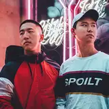
dkdktv
patreon
Anyways this is the poll, so pick 1 between the two options below.

Mobile

Desktop

Mobile

Desktop
option 2 are like the you as we guys know you
Option 2, the aesthetics :O Photographer did an amazing job 10/10. Both of you look so good!
I think option 1 is better, because in the profile picture they are already serious and the cover picture will add some fun environment. Option 2 is too serious for them... their videos are mostly funny and makes other people happy, so the cover of option 1 will represent that.
I was originally gonna choose the first one bc i liked how happy you guys looked but the second dAM the aesthetics
Option2 looks a lot cooler. Danny pretty much looks like a professional model with that look. Danny, you should try modeling, you have that kinda dope look, the ones like we see in the Paris fashion week. And I love your eyebrow. Super cool.
Option2 because the background match better with the profile picture
Option 1 because your channel is fun so I think this one is a better representation of that.
So I really really like no.2 because it I like how it isn't overly matching to the profile pic and I definitely feel like having both of you on your usual sides feels more comfortable and authentic I guess. Like others have said I think the profile pic needs to be shifted a little to the left so that it is more centered. Also, guys, I think that the font you used for your names is nice, but at least for me from a graphics and professional standpoint I'm not sure its the best. I just don't think it necessarily has the longevity that the photo does. Cursive fonts tend to date quickly. I would maybe go with a cleaner modern sans-serif font in all caps and widely spaced and centered between your head and the edge of the banner on either side in the mobile version so that it feels a little less busy and crowded. Don't get me wrong guys I love these they are so great! I just wanted to offer some suggestions. Last thing I promise: I might also shift the banner down (as long as it doesn't cause the text to cover your faces) just to the very edge of David’s head/hair, I just think that it would open the frame up and make the setting feel a bit wider (idk if that makes sense).
I choose option one because It shows both ur funny and serious sides but I really loved option 2 it looked like u two were modeling for a magazine front cover photo shoot.
Option 2 just looks more aesthetically pleasing.
Toughest decision of 2018
Option 2 is better
That gangster look seems to suit Danny in the second one 😝
In the 2nd one you guys even look more mature and classy 😝 (except for a little gangsta look on Danny😅😝)
Thanks! 2nd one seems more focused on our faces as u said!
Haha i shine in both~~~
Ooh u looked close enough to recognize the wifi signal lol.
Both fits then!
Hmm maybe its because it’s danny who cropped and placed stuff on option 1 lollll
Agreeable. For the long run 2 seems promising since it looks more professional.
Oh noo its soo difficult..Danny looks more fun in first but David looks cooler in second...no offense lol. The aesthetics of 2nd are more nice and vibrant and focussing your faces more...so i think i might go with that...though i liked all your pictures from this shoot👌👏
Umm I think the second one is better. Danny did a great job in the second one. David shines in both!
i think i'm in a more stonger situation than yours LOL 😬 i liked all the photos you took and everything you showed on the video even the WIFI in the middle of no where! haha, but i'll just go with The second option
Option 1 shows how dorky Danny and David really are in their videos but Option 2 looks so cool ;-; ahh~ idk anymore...
Also yes, like someone already mentioned, I wish u didn't have to change the profile pic.. Like it's kinda how everyone identifies you 🙁
Ughhhhh.... I hate a confusion... I am so into 1 coz like I already told u before, it's just more representative of u guys (coz y'all dorks that laugh and have fun more than 'stare straight into your eyes and melt you with hotness' models) But somehow the cropping or placement as a banner or something makes it not so very aesthetic as compared to 2... Like 2 is damn in your face good... But I want 1 to win so bad 😭😭😭 So I'ma vote both! 😬😬😬😌
My initial reaction was 1. It evokes an immediate response. Option 2 however works better in the long run which is what a banner is for. It’s the type of picture that you unconsciously look at to see something in it you hadn’t before because it’s not ‘in your face’ like the first one. Option 1 is great for when you need something that immediately grabs your attention but doesn’t need to do so after that, along the lines of an advertisement for a single event.
option 2 is goooood
and also, when people see the header, they're not going to psycho analyze your expressions. They just want it to look good. option 2 has a good vibe
This is so exciting honestly. I can't wait to see it on the actual web page! Also the icon should be centered a little bit more but over all option 2 is easy on the eyes. And it highlights your names more. Thanks for letting us give our opinion!
Nice chatting. Good night or day to everyone.
Sophia so true. Lol!
Hahahahaah uncomfrotable cuz too close to dannys face lolllll
Haha flow of consciousness led you to voting lol. But yes all valid points.
If forced to choose I would go with two I guess I may vote after all?!
Well in the first shot Danny eyes are closed and in two your expressions are too different
I like banner 2! banner 1 kind of makes me uncomfortable because it feels too close to danny's face. Also you guys should maybe move the icon to the left a bit so david's hat isn't cropped out!
Yup
Why do I not like them?
Oh but why tho?
Sorry guys I'm not a fan of either I would be choosing "the lesser of two evils" I;m not sure I will vote Haha!
Yeah the profile pic is very attached to us😭😭😭
Yeah the feel is different when cropped. The menubar color is random i think.
How about banner 2 and as a profile pic 1? Maybe not change the profile pic at all???
Unfortunately no 😭
Ooh. You have a good point there!
Yeh we look def more natural lol
Indeed. Lets see how the votes come out!
More professional right?
Our characters?😁
Yeah its more friendly agreeable.
Thanks 👍👍
But ya option 2 for sure 🙌
i really liked the photo in option 1. but after seeing both options cropped to a banner size, i ended up voting for option 2. the background of the street going off in the distance gives the photo more depth and frames you really well. i prefer the colour in the menubar of option 2 as well. it matches the photo nicely. ur photographer did a great job 👏🏽 tbh i wasnt expecting it to be this good after danny’s insta posts 😂
Guys do you have a picture of you guys smiling in the bg of option 2
honestly. Option 1 is the same clothes as your profile pic. You got to spice things up and make it look like you totally didn’t take the pictures on the same day and same clothes. So option 2 is the way to go. (Lols that rhymed).
Option 1 is like a natural to both of you and kinda fun to watched it if you choose option 1..
I was originally leaning towards Option 2 but I feel like Option 1 is a lot more true to your personalities
Option 2 will attract more people to your channel. That's the kind of picture youtubers usually put.
Option 1 seems more representative of your channel
Option 2 is cool but Option 1 I feel is more inviting for future ducks
Dudes hands down for option 2. Dope af