YummyTiger
patreon
It's been 12 days, and I want to give you guys an update. There are going to be a few changes. I hear you, and I take your concerns seriously. I'm also more than aware that I'm a terrible predictor of when I'm going to have things ready. In lieu of release dates, I'm going to try the smaller release structure. I don't like to go months without giving people some idea of when the game will be ready, but trying to give you an idea is one of the big reasons things have gotten so frustrating for people. I figure with a more consistent, smaller release model, I won't have to do progress charts, release dates, etc., as you can see things are moving forward.
Releases will go as follows:
Proof-of-Progress: very small, buggy increments that I would not recommend playing. They may show off a few new portraits, artwork, a new game idea, etc. These will be the most consistent releases that will show progress. Even if you don't play them (which I recommend you don't), at least you should have some indication that things are progressing when you see the posts.
Beta Releases: These will be semi-polished releases that have sizable gameplay. I'd still avoid them, but at least these should be a fairly enjoyable experience. Version .10 (Prologue) will be the first beta release. I expect there will be 3, maybe 4, beta releases for chapter 1.
Full Releases: These are the polished, full releases that are planned to be public. There will be six of these (.10, .20, .40, .60, .80, and 1.00)--coinciding with each chapter.
Patreon tiers are going to be reworked, and Patreon rewards will be adjusted to fit this release system. $10+ will have access to everything. $5+ will have access to beta, and full. I'm going to offer higher resolution artwork as well, which will be included in all tiers. I had talked about it prior, but never really started posting artwork consistently. I will hold onto the higher resolution artwork until after releases for the most part, to avoid too many spoilers.
I will not be offering any more release dates, or informal predictions. I can't meet them, and they merely frustrate you guys. If you ask, I'll simply state that I don't have a date. That said, the purpose of proof-of-progress releases are to be consistent indicators that work is being done. I want them to show the game is moving forward, so it would not be unreasonable to expect 2-3 a month. Chapter 1 will be unique, as they should be faster given that most of the work is done.
In addition to the changes, the Man in Black is going to be cleaning up my Patreon significantly. He has been working on it with me this past week. He will be clearing redundant posts, rewriting tier levels, and taking a more active role on the Patreon side of things. I'm handing more responsibility off to him, and converting his role into a paid position. It is apparent to me that I need help, as I simply cannot do it all. I'll be releasing .10 with the new Patreon rework.
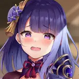
In the meantime, enjoy the artwork. This was one that I feel is vastly superior to the old artwork. I know art is subjective, so you may disagree, but I really feel I've improved in facial features, hair, shoulders and alignment. For me, it's not comparison and was completely worth the time it took to revamp the artwork.
Thank you,
YT

Perhaps a bit, but I was more aiming for the potato sack to be tighter and pushing her breasts up a bit. She is meant to be a C/Dish cup.
MUCH better! Not a cartoon like. Now it is really like a Manga/Anime. Thank you and keep it up! Wait are the boobs now bigger? ^^
she is very sexy now. XD
Probably angry because .03 still hasn't come out and there isn't even a hot fix for .02
Cool beans being on Discord, can you send the invite?
Hotfix coming to a pc near you in 2021
Nice art rework but... can you hotfix beta 0.2? It's completely unplayable because of goblin face bug.
She seems angrier.
Discord is up. I'll make a post about it with the .10 release. I wanted to do it all together. Get Patreon redesigned, release the prologue and start a true cycle of releases, open up Discord, etc., but I may just have to post it before Patreon gets reworked. We'll see how things look tomorrow, but I'll be on Discord if anyone wants to chat. I'm hoping the bot works and assigns permissions correctly!
Now this is a rating system I could get behind!
The potato sack magically augments breasts, duh! I thought that was obvious... (/sarcasm) They are a bit more balloonish because I figured the potato sack was tight and would be creating an almost push-up bra effect. Plus, I like cleavage, hehe.
<a href="http://2.bp.blogspot.com/-fiOhoKgnpsU/U4B9yigVSuI/AAAAAAAAlSs/uHUB5Ay62fM/s1600/pam-anderson.jpg" rel="nofollow noopener" target="_blank">http://2.bp.blogspot.com/-fiOhoKgnpsU/U4B9yigVSuI/AAAAAAAAlSs/uHUB5Ay62fM/s1600/pam-anderson.jpg</a> this is a picture of pamela that shows her breast size better than most, and in an outfit that supports her breasts similarly to aylia's current outfit (at least in the picture, and not in lore, iow a potato sack). you'll notice significantly less bulging in pamela's than either of them (the one on the left is better), so aylia's breasts on the left is about DD rather than D <a href="http://www.glamour.com/images/beauty/2013/10/pamela-anderson-pixe-haircut-main.jpg" rel="nofollow noopener" target="_blank">http://www.glamour.com/images/beauty/2013/10/pamela-anderson-pixe-haircut-main.jpg</a> there's a picture of her well after the second boob job that put her at DD. and here's one with her breasts before any boob jobs (34C) and after both (36DD): <a href="http://acidcow.com/pics/20100322/celebrities_before_and_after_boob_jobs_03.JPG" rel="nofollow noopener" target="_blank">http://acidcow.com/pics/20100322/celebrities_before_and_after_boob_jobs_03.JPG</a>
Wow the difference really is night and day! Great job!
Thanks! I also like the new stance quite a bit. It is one of my motivation pieces that I look at for a minute or two when I get frustrated with artwork I'm working on. Kind of as a way of saying, "You can do this!"
Thanks!
Don't forget, prior to about 4 years ago, I'd never drawn in my life. No training, no practicing. I watched a few videos on drawing in Flash and decided maybe I should try. Not saying you can't be nitpicky, but realize that I'm an amateur artist through and through. There will always be some issues, I just don't have enough experience with human anatomy. Doesn't mean I don't take the critique and evaluate how I setup future artwork, but I do want to stress that you should know what you're signing up for. As for the potato sack, I didn't want to go overboard. The potato sack gets about 20 minutes of game time. To spend a crazy amount of time on it would be asinine, even for me. The primary reason I even spent the time redoing this, is because I reuse this stance for the peasant dress. Therefore, I wasn't spending lots of time redoing this solely for a garment that gets 20 minutes of playtime, I was doing it for two poses that get a large chunk. So, I kind of cheated and simply made the potato sack look nice, but did so within my current artistic ability without trying to learn how to draw a more rigid article of clothing.
I like the stance, it's much more dynamic, but her left shoulder is too small. And just to be nitpicky, I think her left thumb should be lower. But it's just to be annoying. About the potato sack, it would be perfect if it were a normal piece of clothing, but it's not. I think you missed an opportunity to make it as uncomfortable as possible, rough and too tight around the breasts, so Aylia should constantly struggling to avoid having her boobs popping out and tugging up and down to find the impossible balance between hiding enough and limiting the itching sensation of the material. That's a good idea, you should do it. Of course it would delay the first chapter by six month but I'm sure nobody will complain. You should ask an unlock of your thread on ULMF to announce it.
Gotta say really impressed. Wasn't 100% on some of the faces for the revamped artworks but this is 10/10.
Scantily clad elves will do that.
That's the goal.
I little, but it's from the more open leg stance and the angle.
Next week. I think I can give a release date for the Discord :-P
Oooo, now that's an art upgrade. Not only is it more dynamic, but Aylia's looking murderous!
Mostly due to redundant complaining. Was going in circles.
It seem the UMLF was re-locked.
For story purposes I prefer the body language of the figure on the right. She's in a strange world and dressed in a way she isn't comfortable with, so it seems early for her to be so relaxed. The figure on the left looks confident and take-charge, which doesn't feel right yet. The figure on the right looks tense and angry, which feels better for this point in the story.
I dunno, I like the left face better, the right seems to look like a sneer to me, and I don't see that of Aylia, now the left looks like she's grinding her teeth, which if she is still dealing with Bogwort, is understandable. Also the slight tilt to her head has a subtle attraction as well. Her ears look more natural in the left pick to me, but ears do come in all shapes and sizes, and the arms look more like a ready for combat pose on the left then the right, imo. The daggers look good either way, and the potato sack does not look as uncomfortable on the left as the right. I agree with the boobs on the left not being as "realistic" as the right, but hey this is fantasy, chain mail bikinis am I right?! :D I am a bit torn about the panties, I sort of got used to the brown ones in the first prologue, but the white ones have been gaining my interest. Mainly because there is less of them there. :D And then there is the hair, I'm am almost as much a hair man as T and A, and the left pick just ... calls to me ... Anyway to each there own, but all in all, I like the new artwork!
Y'know, you never do indicate which is the new and which is the old, assuming that us art connoisseurs will naturally realize which is which. Anyway, I like the face better on the right, an perhaps the dagger and forearms as well. The panties, and especially the breasts, are better on the left (perkier, fuller, higher, probably less realistic....)
Oh and when is the Discord becoming a thing? Is the man in black setting it up? How will we know of it?
left is better but i like the old Bogworts.
i want to fuck left more than right , so the revamp was a success
Her hips sorta disappeared.
You've clearly developed a lot as an artist, and you've made it clear it's something you're comfortable with now. I just hope that, now that you've developed your art, you can focus on your development skills and improve that process even half as much as you improved your art skills.
The new artwork is impressive !
So it looks like releasing a few more spoiler images here and there would have a rather dramatic effect on the complaint rate. :D
Wow, that is a huge improvement in artwork. I'm no artist, so I can't tell how to improve something, but I can tell when something looks better than it's predecessor. The old picture, she looks mad. The new picture, she looks SCARY. Oh, and the shortsword looks more like a sword now too. :D. (I'm a detail nut). As for release dates, AAA games having to rush to meet a release date has meant either crappy games, or good games that could still have been better. As GabeN once said "These things, they take time" (Valve may take forever to release games, but when they do, they are awesome.) *wink wink*
The bag was crunchier :3
Sounds great, looks great.
Y'know, any complaining I might have done about delays seems wholly unjustified now after seeing an improvement like this. Yeah, I still wish I was playing chapter 1 six months ago, but I'm really happy to see you taking steps forward as an artist here. It would be a shame to deny you of that. I'd say that it has renewed my ability to wait for the release, now.
Damn boy thats good.
New artwork is vastly superior. She looks more meek now, which I think is better too :) For development methodology try a rolling release. Keep the main branch as updated as possible and just release it every week (or what ever your schedule would be). Even with good unit and integration tests you won't catch everything so just make sure you have a system for handling the escapee's (otherwise you will either ignore them or spend too much time managing them) let your code out into wild.
First off, I love the new artwork, it certainly shows you haven't been sitting on your ass all day. Secondly, I approve of the new no release dates policy. Release dates always caused you more trouble then they were worth and would actually waste your time significantly Yummy-Tiger. Mostly because you have to stop what your were working on and explain your situation over and over again. Finally, I'm glad to hear your getting website support from the Man in Black. You can't do everything yourself, and Yummy-Tiger taking a smaller role on website is not going harm the hype here.) It will allow you more time for your art work and moving the game into RPG Maker.
Wow, that's one hell of a change. On top of the technical improvements, I really like that Aylia actually looks like she's about to fight now. The old art just made it look like she was really pissed off at the player for making her fight in a potato sack. Which wasn't ALWAYS our fault.
Love the new artwork. Like others said before, it looks like a completely different artist did it. Keep up the great work!
I too will miss the belly button, but not so much that I won't enjoy the new artwork on the face. Simply Amazing YT!
*SMACK!* :D
Well, I won't be missing any more dates, so there won't be radio silent for a week. I've been working, on everything. As I said, with more frequent updates, it shouldn't matter.
The deadline thing isn't really as much about missing it, as how you're missing it. Take update .10 as an example. In the last update you had a comment saying that you hoped to have it out tomorrow, Thursday or Friday, so the 10th, 11th, or 12th. A week later on Thursday the 18th, we get our next post that says nothing about when update .10 is coming out. If we got a post, or hell, even a comment, on Friday the 12th saying something like "hey, something came up, it'll be a few more days, sorry" you'd get some whining, but not the shit you get every time you miss another deadline and go radio silent for a week.
Soo any release dates for chapter one? ... ;)
I liked Aylia's belly button, now I won't be able to see it? :c
I also like the old underwear much more.. it made her unique
New artwork is higher quality, I totally agree...but am I the only one who liked the old style underwear more?
Ild was cute but this is great. Shows the emotion. Hope things go fairly as planned, good luck and looking forward to the next update! :)
The old artwork was amazing anyway - while the new one is definitely an improvement, you really should focus on releasing chapter 1 in full before you start making art changes. I understand that your preferences changed and everything, but if you spend ages changing the artwork now, then by the time you finish the chapter you might want to change it again. I think listen to your patreons and please release the chapter. I get that you don't want to give a release date anymore, but you already promised end of May for Chapter 1 - are you saying now that is no longer the case?
So .10 is going to be the prologue? New artwork is quite a bit better but tbh it seems like it shouldn't even be a priority atm. Anyone who pledged to this was ok with your old artwork that didn't require redrawing everything.
The improvement in art quality is massive, its like completely different artist replaced your old self. Still im disappointed - i thought your next post would be the release of an updated full prologue.
I do like the new art. Here's hoping restructuring helps.
OMG! I'm in love with this new artwork. You did such an awesome job. The old Artwork was good, but this one... This one is at least 10 times better... Wow, just... Wow.
You're really doing great for a one man team, just so you know :) This planning seems solid and the artwork looks very professional and attractive. Fingers crossed.
Quite an improvement, visually speaking. You definitely grow up as an artist.