YummyTiger
patreon
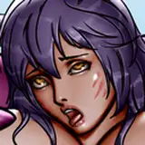
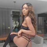
Still here, still making progress. Enjoy another teaser of the new MV artwork. I left her potato sack layer invisible, because well... it's fun!
Some positive news, I'm going to be working fully on Aylia's Story starting early August for the remainder of the month. I've put in a lot of work in July to make this happen. I always said if I got a chance to work full time on Aylia's Story again, I wouldn't piss it away. Well, I'm sure as hell going to try. As for the release, Trello is pretty accurate. The maps remaining requires me to update them to the new tilesets which is time consuming. I'll keep posting and trying to show you guys progress though.
YT


I concur with the comment on the panties. I just changed it to have a break like the prior picture. That change only took a few minutes, and since looking at her ass is nice, it was worth it :-)
Generally agree with YT here, though the older one does benefit from a more twisted-toward-us posture. The only real advantage I see in the old art is the draping of the panties - just that smooth section up top, instead of the unbroken curvature of her bottom in the new. They're both lovely images, and the new one has definite improvements overall. Have fun working intensively, and good luck!
I guess I could see some of that. I definitely don't think she looks heavier in the second. Her thighs are clearly slimmer, she has a nice thigh gap, her waist is also slightly smaller. She is more turned away, so maybe the posture is deceiving.
I would have to say the first is 'hotter' to me. Something about the posture or something. The second is like someone just standing around whereas the first is like she's become aware of me and is looking over her shoulder at me. Aside from that, the nose is a little more rounded in the first. Not to put down the second, and maybe it stylistically is better, but I don't care too much about that, to be frank. Aside from that, I have to add that it seems like she is putting on weight. I was hoping she'd be slim and fit in a petite way, but to each their own and I'll still be waiting and watching.
You know, Yummy, it's hard for me to state my point of view the way it won't look like arguing with you, and it's the last thing I want as I greatly respect your story, world and view on the fun here. If to speak about just the quality of the first girl standalone, then shoulders and spine looks unhealthy, ass looks strangely under the panties and knees are too thin to be real. But if to speak about the perspective of the two drawings, even if there's anything like that (but old shoulders look more healthy for sure) it's not picking my attention at all. And if I look at the second pic only, I can't name it in any way bad or needed to be remade. Of course, as the artist you look at the shadows and the technique more (and moreover if it's the yours one, the progress of which you can be proud of), but me as a lowly elf-fapper I only see the lechery hottie(s) and bawdy guy(s) who wants to have some nice fun and how fun it is for me to get from the playing. For me this upgraded art if adds anything to the game's atmosphere, playability, my ability to have fun from it, then it's very insignificant. Sorry once again to maybe sound rude or offensive or anything else (and not in native English also), but I respect your choices that you make with your game because it's not only pleasure for us to play it but also for you to make it. Just my perspective.
I disagree completely on that one. Proportions were wrong, shading was screwy, her camel toe was showing like she was bent over, but she wasn't, Her hair was terrible. But, art is definitely subjective. The new one is stylistically the same as all the game's artwork now, which was also important to me.
The one with the sack was better.
Nice art work, please keep the turtle moving and continue to take your time.
For those without Discord access: https://trello.com/b/JUvqGocH/aylias-story-development-board
Very Yum(my) pictures ;-) Thank you
Dude just release it
Nice work Yummy. The art looks good.