TeacupAudio
patreon
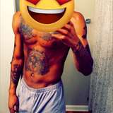
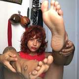
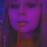
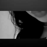
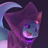
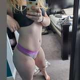
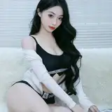
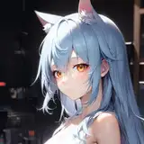
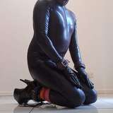
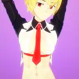
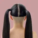
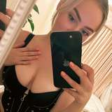
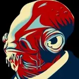
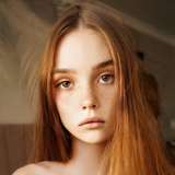
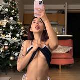
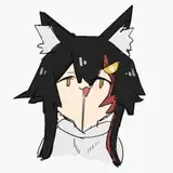
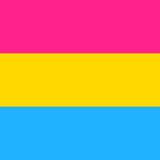
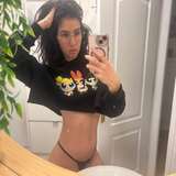
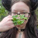
Dee, in all her talent and wisdom, has provided us with the opportunity to update our thumbnail style.
So, which one do you guys like?
1, 2, 3 or 4. Comment down below.
Let me know. Thank you for all your help.


3
2
2, less crowed and text is easily readable instantly to the eye
2
3 or 4
2
2
Leaning towards 3, 4 is also good
4 goes hard
2
3 it centers on cute girl while forcing to read text
4
3
4
3
1 or 3
4
2
3 is the best one
4
3
4
3
2 because the darker colors are more relaxing and I like the characters off center. It creates a more interesting image.
2
2
4
1
4, definitely 4.
1
4
I don't know who did all of these but holy crap there all great. I'll say 1 but honestly there all amazing choices that can work depending on the audio.
2 or 4
4 & 2 👍🏽
2
4
4 and 2
I like 4 the most followed by 2.
1
2
I’m a fan of 2 :)
3/4
I'd say 2 or 4.
I personally would prefer option 2 or 4.
I'm liking the style of 4 but 2 is great too.
1, but make the first line smalled and a different colour, like in 3
3 jumps out at me, but 2 & 4 make the text easier to read while the location of the character is more "interesting" (because it's off-centre - something something art and photography magic that I greatly appreciate but don't actually understand)
2 or 4- the text isn't difficult to make out in comparison the the rest of the coloration, and the image isn't competing with the text.
3
3 looks more pleading.
2. It’s clear enough to easily read on a small screen and you look very cute in it! ❤️
4
2
1
1
1 or 4 would be my pick🤔❤️
I like 2 the most. The [square brackets] in 3/4 are also good though.
I like 3
3
4, dunno it's just, is
4
Ich like 2
4
I like number 2 stylish yet simple
2
1
I'm digging #3 myself.
2 is solid with 3 being a close CLOSE second
1 would be my go to.
3
1
2
I like 2
I like the text over the character personally. But for this audio specifically 3 or 4 is the only right options right? I mean the audio is about asking a favor so it would make the most sense for the character to be pleading in the thumbnail.
2
Tough choice, but I think 3 edges it out.
4
3
2
2
4
2
1
2
1.
Have always loked the og, but nr 2 and would say 4 is a close second
4
Lovely Stuff. I vote 1 though.
1
4
They’re all really good, but I like 1 a lot.
All good, but I think I am leaning towards 1.
4
1