Loish
patreon
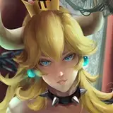
These are the basic steps that I use when I make studies from photo reference!
The most important thing for me is that the rough sketch is expressive and stylized. The further in the process I go, the more ‘realistic’ it starts to get and the more it loses the movement of the first sketch. So I always want the first sketch to be as expressive as possible - and as you can see, I don’t really sweat the details at step 1 (just look at her face!)
Step 4 is also an important one: changing the color of the linework gives so much depth to the color scheme. This is something I do in all my digital art pieces. It helps to give extra dimension and life to the art!

May I ask where to join this group on fb? I’d love to join <3
I will try to practice this weekend following this one :) Thank you Lois!
Perfect!, that's a great idea. I'll do that, thank you!.
hey! i usually just leave it, but it can be an issue especially if your lines are dense. you could always create a selection of the lines, fill it with the background color on a layer underneath, and then merge.
Hi Loish, I've learned a lot with your art process, mainly to work faster and with better quality, thank you!. In my last artwork I changed my lines to multiply and by the time I merged with the character colors layer, the lines outside the character looked without the multiply effect. Is there any way to avoid this? or is just that I have to merge everything (including the background).
the line layer!
Hey Loish! On step 4, are you changing the line layer to multiply? Or the color layer?
thanks so much!! I'm glad you like it and I really appreciate the feedback - I'll create more of these in the future :) thanks so much for the support and I hope you'll continue to enjoy the patreon content!!
Loish, first off, I wanted to say (I'm sure you get this a lot) that I have been a fan and admirer for 17 years now. I have 3 pieces of your artwork in my studio which get complimented and questioned by my clients on a nearly weekly basis. I have also been a member of your FB digital art group for as long as I can remember it being available. It's an incredibly helpful community, so thanks for that. I finally gave in and subscribed to your patreon (the first artist I've ever felt compelled to do this for)! This step-by-step is exactly the sort of content I was hoping you would provide. Thank you so much for giving us a look at your processes and offering suggestions as you go along. I can't wait to see what else you give us in the future!! BRB, starting a new piece using this guide right now. <3 Thank you.
haha it can be pretty scary! but it actually saves time for me, since i don't mind keeping the drawing a bit rough.
Wow this is so helpful, thank you!! I've never tried merging everything before adding details as it seems kinda scary, but I really want to try it now :D
definitely! i agree. it's much more like traditional painting that way.
happy to hear that! i use a round gradient, so that it only covers a small area. I also lock the transparency so it doesn't go 'outside of the edges' so to speak.
So helpful! How do you get the gradients at specific places?
Merge all layers and paint in one! that's one of the keys to make drawings look less digital in my opinion :)