Bound By Night
patreon

Update: Opened up to everyone
Hi all!
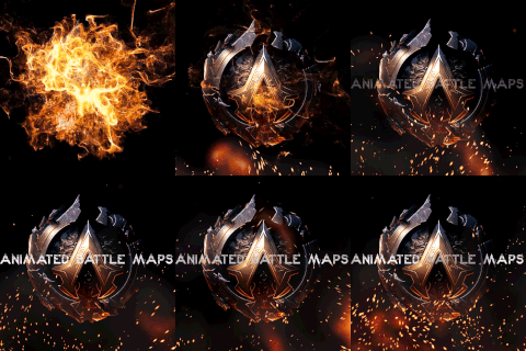
As I've been experimenting with this sandbox, I've been thinking about the UI for BBN, things I can do to update it, and also just make the whole thing look a bit more polished. Related to that is updating the splash screens to feel a bit more theatric and interesting, and that could involve updating the logo. I spent a little time looking around at logo generators yesterday and found I quite liked one of the results, which I'm sharing below and would love your input on.
As a quick bit of background, the current logo for BBN (also below) was generated on a website focused on Twitch and YouTube streamers. (I was dabbling a bit with Twitch streaming and used it to generate overlays, frames, etc., and had it quickly spit something out for BBN.) I like it fine, but I don't feel it really means anything specific as to BBN. It sort of hints at a rope or something that could be binding, but that's about the extent of it.
In contrast, I think this alternative logo hints at a moon with the round circle and the "swoosh" enveloping it honors the current logo while also suggesting something trying to surround or bind what is in the center, and could also be blood. The nods towards blood and the moon a reference to the vampires and werewolves in BBN.
Anyway, those are my thoughts. This isn't free, so I do want folks input before I make a final decision. I would also welcome any feedback you want to share in the comments!
Finally, I'm starting this poll at the Lycan+ tiers but will gradually open it up to others as well.
Current Logo
Possible New Logo
Note: The colors of the new logo can be modified in Photoshop. For example, I could edit the top-right version of the logo to appear as a blood red logo on a black field (or any other combination of colors/textures).
No, NO! I mentioned above that I often make custom logos for the various Itch-Io games I play. I also custom design folders for them as well! This constantly changing logo would mean for me a constant change of folders OR *sigh* a folder with ALL the logos on it, which I would have to keep revising every time a new logo was added. PLEASE, NO! I had one creator who changed his COLOR THEME for his logo and start menu, and *argh* I had to do a major revamping (PUN!) of my logo design and the custom folder I had made! **
I was also going to suggest this as well. The Moon should look something *like* the Moon. I like the free standing image without a title best. I think red logo on black ground works best for colors. I don't mind having a title in the logo, but that little box after "Night" to me throws off the design. I *never* really understood what the original logo was suppose to "be", other than an abstract. I often design or redesign the logos for the various Itch-Io games I play and support on Patreon, and when I first started playing BBN, I put the current logo in from of a loop of a darker red and really liked that, (This being Patreon, I cannot upload the image for my version.) SUMMARY: For me, Moon that looks like a Moon, with swirl, in red on black background, and no title. **
The colors should be high contrast: red,green, black,purple, or blue on either white or gold. Or vice versa.
I actually thought the 'swoosh' made it look kinda like an eye, which feels more foreboding to me. My first thought was of the creatures. While I agree it'd be cool to make the circle look like the moon, my suggestion is to put a particularly large crater in the middle to make it look like a pupil. Maybe with some smaller ones around it to look like an iris.
Absolutely. Now that I know a little more about Photoshop, it is very doable. (Color of the font might be more difficult for me, but a large block/shape filled with a single color is easy.) I could do something for pride month, different parts of the game, different websites that require certain backgrounds, etc.
In theory you can show different versions/Color scheme of the logo in different part of the game. Black one in one scene, red in other...
I don't see any particular reason to change but if you really want to then go with whatever you are comfortable with.
That you feel more drawn to the new logo, please update to the new logo to include the HD image of the moon's surface as you see fit!
That's a great suggestion. I can't do that with the logo creator itself, but I could do that in Photoshop if I purchase it. One variant I was thinking of was an HD image of the moon's surface for the circle, and a red HD texture file for the "swoosh".
If the center circle is meant to represent the moon the I would suggest added in some of the moon's features to the image. It would then be more obvious how the new logo ties into the theme if the novel.