Bound By Night
patreon

In addition to the new logo, I've also commissioned an artist to help with a revamp and update to the game's GUI. This is going to include the main menu, preferences/options menu, text boxes in dialogues, etc. This may not make it into the next update, but it is in the pipeline.
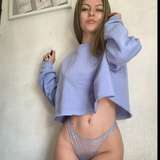
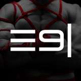
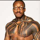
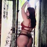
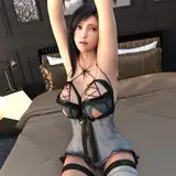
While the artist is working on this, he gave me permission to share with you some very rough mock-ups of some concepts we're looking at for the main menu. Please keep in mind, the models are placeholders only, but the idea is characters from BBN would take their places, whether it's the generic stock models in one set, or the four copies of Nick in the other.
What do y'all think? Prefer one style over another? Prefer one layout over another? Let me know in the comments.
Personally, I'm leaning towards the black leather background with the model arrangement in the top-right (#2), but I'd really like your thoughts.


Number 2. Anything else feels too crowded.
I like 2 the best because of the spacing it gives the logo and allows it to shine and not feel crowded.
I really like #1 the best. It balances the entire image very nicely.
I'm stuck between 1 and 4, and I like the leather look too.
I prefer solid black to the leather effect myself. I also feel not having characters on the screen fits the mystery of the game. Though for new players finding the game and deciding to play it (aka promotion *facepalms*) having the characters visibleis a good idea. I like the duality of groupings in 1 and 2, though I'd say try and mix them by having the logo be as prominent in 2, but the bodies as fully vissible as 1 (aka, not just torso's). Jason Lagasse's suggestion of Alex in the middle to represent his choice is a great idea too. You could then change the groupings in later season releases as fits the story if needs be.
I like no.1. But I'd rather have the whole logo, some characters and some room between them. It feels less crowded.
I like no. 1 and 2 best, but leaning towards 2, with the central logo even slightly larger.
no. 1 or no. 4 - It depends if you want to expose some antagonism or not. No. 4 could be more neutral and especially for new players better.
Love the new logo with the werewolf, and the concepts for the main menu! Like the balance of #3, and the black leather background, but I will need to see the main menu with the characters before I could choose one.
I love the new logo, the moon concept came out really good! I am going against the grain on this and saying #3. If you have Mayhew on one side and Nick on the other with Alex in the middle it gives you a perception of the struggle Alex maybe going through between picking a side. Atleast the sides we know exist at the moment, until we get a plot twist. LOL Yoi can then you filling the area between them with the other characters.
#1 + #2. But in number two I think 4 models is too much. Why not one model randomly chosen? Or changing one to another?
For me #1 is the clear best
Looking really good. I prefer options 1 and 4 for the main menu screen. The leather works well, too.
I like #1 + #2