MrZGames
patreon
Hey friends!
I hope you are having a wonderful day
Recently I played one game, and I liked the visuals and made me rethink some of the things I did on my games visually.
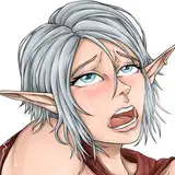
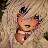
So I been playing a bit with postprocessing, and I wanted your opinion on which option you like more
Option 1 is as currently is
Option 2 is a possible new setup
Just vote on whatever you like the most!
Option 1 is always on the left, option 2 is always on the right, it is a bit more lightened up and colors are a bit more vibrant without burning the image.


I will upload the images separatedly as attachments in case you wanna do a closer examination.
Have a wonderful day friends, and enjoy the update!
I forgot to mention (now I updated the post) but on the last update (yesterday) I also added the option to upgrade your gear, so if you find Akarian sunstones or moonstones, bring them to the blacksmith to upgrade your weapons and trinkets!
![[Poll] Small visuals change](https://img5.patrefans.com/storage/3/sc/ha/563145-019e8f7f-ec2b-7a0e-9069-9ac20383fc0e.jpg)
![[Poll] Small visuals change](https://img5.patrefans.com/storage/11/wk/dk/563145-019e8f7f-ec3c-79af-8ce7-b8e1dfb20f95.jpg)
![[Poll] Small visuals change](https://img5.patrefans.com/storage/2/os/cv/563145-019e8f7f-ec48-77ed-8c6a-487eaa3bc0fc.jpg)
![[Poll] Small visuals change](https://img5.patrefans.com/storage/3/js/rn/563145-019e8f7f-ec52-7547-ae5d-cc1f0e6757fb.jpg)
![[Poll] Small visuals change](https://img10.patrefans.com/storage/3/ei/dm/563145-019e8f7f-ec62-72dd-a50c-f305fafff1ed.jpg)
![[Poll] Small visuals change](https://img5.patrefans.com/storage/12/cc/md/563145-019e8f7f-ec64-7b65-a792-71fd84ba91cb.jpg)
![[Poll] Small visuals change](https://img10.patrefans.com/storage/7/th/qd/563145-019e8f7f-ec72-78d8-9459-1dadce52b74f.jpg)
![[Poll] Small visuals change](https://img10.patrefans.com/storage/12/hg/xc/563145-019e8f7f-ec7c-772a-8ea1-c581d295b730.jpg)
![[Poll] Small visuals change](https://img10.patrefans.com/storage/1/jq/si/563145-019e8f7f-ec83-714c-9218-48fb7b73d61e.jpg)
![[Poll] Small visuals change](https://img5.patrefans.com/storage/11/pm/pa/563145-019e8f7f-ec9f-76e0-b2e6-3c70b9d0cbcc.jpg)
Think the skin color comes of as too shiny on the right
Right one has way too much bright, when you look skin colour
The difference is slight, but visible. I say go right.
If the environment was adjusted with the characters, it wouldn't contrast as badly.
Maybe it is the setting, the shots being in a dark dungeon, but option 2 looks overexposed or too bright. I would keep it as is.
Honestly, I don't see much difference. For me it looks just like the brightness slider in the options menu was moved a bit.
so far i really enjoy the game but i feel like Magic is underrated kind of or am i just doing it wrong it seems like the Warrior beats the shit out of me before i even cast any good xD