artwitchstudios
patreon
We're working on having a shiny and sexy UI that's different from the plain old default boring box. It's still a work in progress, but we'd like to hear what you have to think!
The first image was the first iteration, it looks nice but it's too big and chunky. Too distracting and covers up too much of the screen. We're not gonna use it, but you can look at it anyway :D
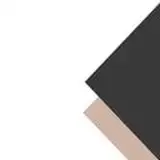
The other images are what we have now. How does it look? Better? Still too big? Are we way off or do you like it?


Thank you very much for your feedback, we'll definitely take your thoughts into consideration! <3
My two cents as both a UI developer and a guy whose kink is hip-to-waist-ratio, I'd strongly recommend going for less is more. I would appreciate if the UI box doesn't cover the hips- I mean, art. The primary purpose of the box is to separate the information from the goings-on in the background, and also to provide a background so the text can be read, so make it as small and subtle as possible. To give some actual points; give it much less padding around the text, and try to work a bit on the form factor. In the last example, there's a black box at the bottom of the box. This can be used. Instead of noting the character name in the top-left of the box, requiring the big padding, put such information in that black box instead. Something like that would be great. Another alternative would be to not have a transparent black box with a large, metal border. Make a solid metal strip at the very bottom of the screen to cover the max-text size (three lines?). These are, of course, just suggestions on how the problems can be tackled. Concerning the art, I think they all look great! I'd probably go for the latter ones, as there's no reason for the box art to distract from the art on-screen, which could happen if it's too elaborate. Keep up the great work! Looking forward to night two (and the Naomi dream hehe..)!
I agree.
The black bar at the bottom seems unnecessary, and without it you could probably drop the whole text-box slightly further down the page. But I do like the style of it overall.