KYDE
patreon
Sup fools,
It's time for that color explanation.

First off, I really, really want to stress the importance of color. I dunno if you see what I see, but just LOOK at that difference. Eagle-eyed viewers may notice some funkiness going on, like her eye on the right. However, with color applied, you hit into that "Gestalt" theory, where all the parts start really interlocking. With colors applied, you eyes and brain start glossing over small errors. You can still see them if you look hard enough, but still. May be different for others, but colors are absolutely the first thing I notice about a piece, and I think it honestly makes or breaks an art piece. In my personal opinion, for coloring that breaks a piece, look at superhero comics from like, the 90's and 2000's.
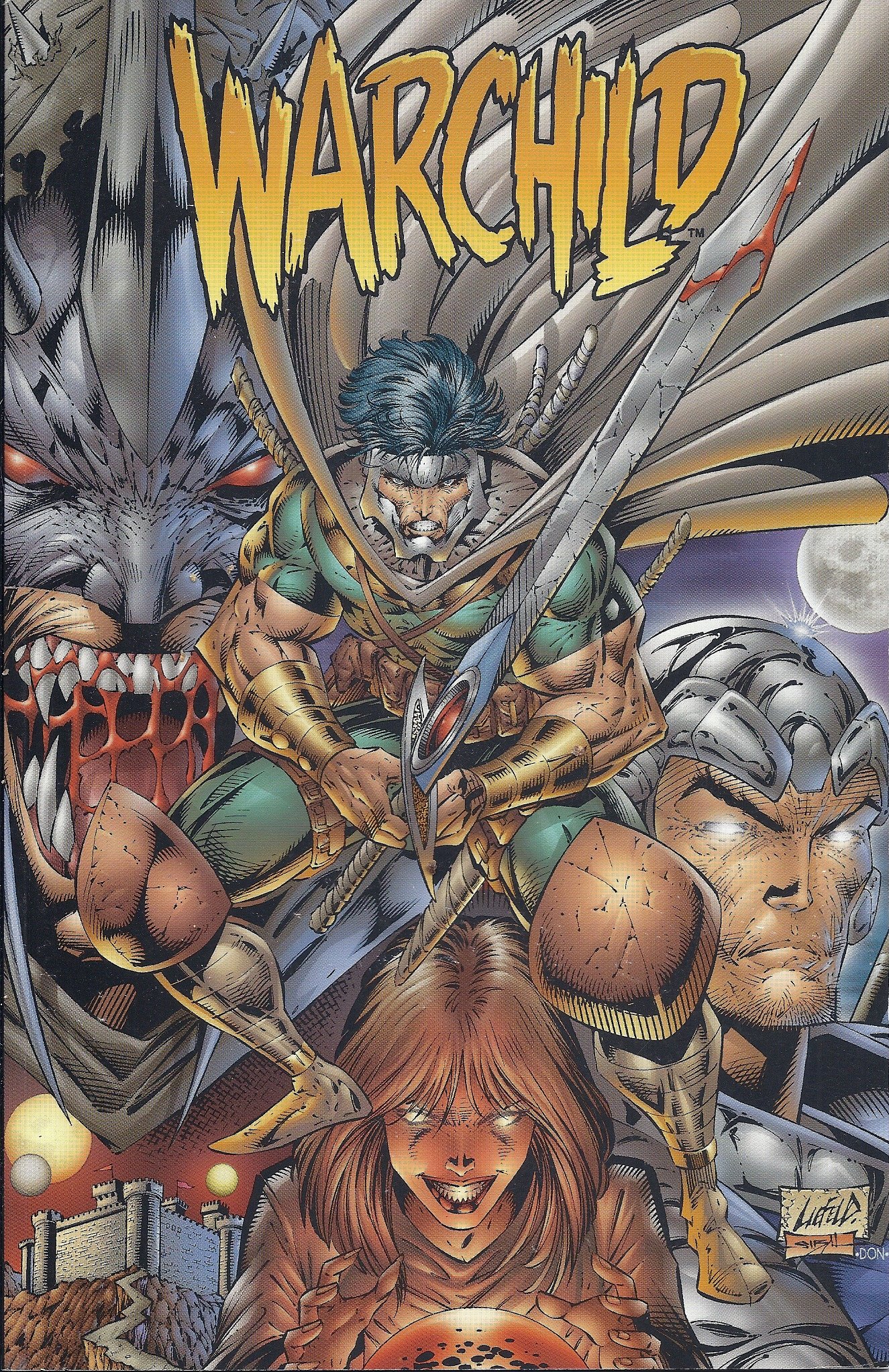
Uck. I get that it's a meme to shit on Liefeld for his art, but I just want to focus on the coloring style in this image in particular. Someone could argue that he's a better artist than I am, and I'd probably agree. But anyway, there's just like this... icky muddiness in this piece. I can't really put my finger on it, either. There's so much going on here. Everything has this kinda gross airbrush gradient going on, it really reminds me of the gradient effect you'd see in old Flash animations. Despite the different colors though, it seems like everything blends together, too. I didn't even register he was wearing a cape. Probably has something to do with the values.

Ooh, now we're cooking with grease. Look how everything blends together. If it was in any orientation aside from up, I bet you wouldn't be able to make anything out. War Boy or whoever isn't silhouetted at all, his values are identical to Evil Batman and bargain bin Professor X behind him. If you squint, it becomes this indistinguishable mass of airbrushed muscles.
You can pick apart this picture forever, but my point isn't to bash Liefeld. My point is that I think the colors totally break his art. Sure, there's a lot I don't like about his art, but I think, with better colors, it'd improve dramatically. You can see this in other superhero art, too. I think Jim Lee is probably one of the greatest comic artists around right now. But his work is colored with like... maximum saturation. Ugh, it just looks cheap at that point.

Like, look at that. So bright. So garish. I really, really feel like I'm stepping out of line by saying this. But it looks so amateurish to me. Like, Jim Lee is remarkable, truly remarkable. But those colors make me see his work and file it away in my brain under "generic superhero art." Contrast this with my favorite comic artist / colorist, Fiona Staples:

Man, those are some damn good colors. She just has such an interesting color palette. It's immediately recognizable. And like, applied to her work, it fixes so many things. My biggest issue with her art is how extensively she uses photo reference for her work. Reference IS NOT A BAD THING TO USE. In fact, how she uses reference isn't a bad thing, either, despite me griping about it. But, she takes photo reference of herself and uses it for her work, again, not a bad thing. However, she copies it so perfectly, that her work starts to look... rotoscoped. Like, the body language and facial expressions of her characters are *too* perfect, and they end up really looking like they were taken from reference. WHICH ISN'T BAD. Her work's still incredible, it's just in my opinion doing that starts to sterilize it. A big thing I love in art is all the imperfections. Seeing imperfections in art work is to see the artist's personality and problem-solving skills. Seeing picture-perfect reference looks like... picture-perfect reference. Like those ultra-realism guys who work with graphite. There's no personality in those. I've seen hundreds of ultra-realism graphite pieces of like, an old guy's face. I can't name a single artist. You're just a camera at that point. Anyways, I'm getting off-topic. Staples' amazing colors completely make up for that one small gripe against her. If her work had the coloring of Liefeld, it'd look AWFUL.
Okay, that's enough critiquing artists I'm not even remotely in the same league of like I'm some big dick hotshot. I just wanted to highlight how important I think color is. I think if Fiona Staples colored a Liefeld drawing, it'd look fantastic. I think it's so, so important, so worthwhile to learn coloring.
"Okay, asshole," you say, rightly calling me out, "if you think you know everything, why don't you tell us how you color, anyways?"
It's easy. First up, I isolate the lineart layer.

Next, I select everything *OUTSIDE* of the figure. All the negative space, if you will.

Hard to see, but zoom in on the edges. You'll see the marching ants. After everything around her is selected, I invert the selection, so it now selects everything inside her outline.

And the black bars, apparently. I didn't think this through all the way. Anyways, with her all selected. I flood fill her with a dark grey.

Oooh, looks neat. But why do I do that? Why not just start coloring? Well, Krita ain't perfect with it's fill tools. Doing this offers up a nice foundation to color on, otherwise little areas that the fill tool would miss would peek through. Doing this helps, despite seeming like more work. After it's all grey, I throw down the colors.

Hey presto. Pretty easy, huh? I literally use the paint bucket tool and fill these colors in, coloring in the eyes with a brush. That's right, ya boy's work is a glorified coloring book. How do I figure out what colors I want to use, though? It's easy. I create a new layer for every color. Why? Once everything's down, I use the HSV/HSL adjuster to get my colors exactly where I like them. When I'm ready to finalize, I merge everything down into one layer.
To animate colors, it's very simple. Just make an animation layer under the animated lineart layer, and fill everything in frame-by-frame. I go one color at a time, usually. It's important to only work on one layer for colors, though, animation layers hog up memory. The less, the better.
With the colors done, now we get into the fun stuff, all the dumb effects I use!

This is what I call the Color Blur. Gives it a kinda softer, atmospheric feel. You'd see stuff like this in older anime, like so.
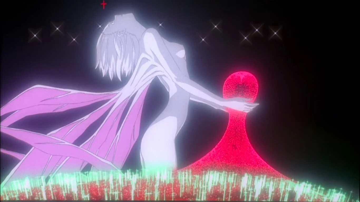
I think this show was about robots or something. But see? similar glow, makes it feel softer and more atmospheric, so on and so forth. I like it, and it's easy to do.
All you do, is take the color layer, put it OVER the lineart layer, crank down its opacity to something like 30% or 40%, and then apply a blur filter to it. And that's it. After the color is animated, take the whole layer and just blur it frame by frame. It's very very easy, and I feel like it adds a lot.
Next is lighting.

Ack. She looks kinda shit and outta place, doesn't she? It's important to note, whatever's lighting your environment will also be lighting your character. It's hypocritical for me to say Liefeld's stuff blends together and then say that you want you characters to blend in with the environment. But, they need to look like they're actually there. Otherwise, they'll look like a sticker slapped on.
How do? First, find a dark color in your environment. In this case, it's a dark bluish grey. Take a whole layer, and fill it with that grey, OVER EVERYTHING. Set that layer to multiply,, inherit alpha, fuck with the opacity, and there you have it, your Shade.

Still looks shit, but you see how it's influencing her colors? It's cooling her color temperatures down, yet it still READS like her original colors. But, let's lighten it up now. Take the lightest color, in this case a light blue, and make another fill layer. Set that one to Overlay. Boom, you've got your Overlay now.

Maybe you disagree, but I really feel like doing that method makes it look like she's in the environment. Her skin is now a pinkish purple, but it READS like skin. To me, at least.
After that, you can dink around with more stuff set to Overlay and Multiply.

One of these days I'll actually make proper shadows. To do those, you do the same thing. Set the layer to multiply, take a dark color from your environment, then paint them on. Easy.
I also blur all my background elements. To do that, I make sure everything behind the character is in their own layer group. Then, I apply a blur filter over everything. Boom, easy. Doing that creates some depth in my opinion, and I like how it looks.
That's kinda it, I dunno what else to say, really. One cool thing you can do is an easy outline. Take your lineart layer, put it underneath the colors, go into layer styles, hit stroke, mess with the settings, and boom. Easy outline.

That's why it's important to have clean lineart, otherwise it'll put on outline over every pixel you may have missed.
Another thing, in that Tali gif, I "Chowdered" in her hood texture. It was super, super easy to do that. All I did was take the area where I wanted that texture and made a separate animation layer for only that color. Next, I put it in its own group, and threw the texture in a layer above it. Then just slap on inherit alpha. Inherit alpha makes whatever's in that layer only visible in areas filled in the layers below. That's why you want to group them, so it's only picking up what's in the group. It makes this cool kinda effect they used heavily in that old show Chowder, and it's very very easy to do.
Well, that's about it. I think I've said enough. If you have specific questions, hit me up.
Excellent write up from you, and well worth the read. We got ourselves a good essay on art going on here!
Some styles are complimented by the artists choice in palette while others tend to be muted if not outright destroyed by them. 2D art (and even 3D in some cases) suffers from the exact same problem cinematographers face when filming their movies and planning their shots, the issue of implementing atmosphere into their works in ways that will either pop out to the audience or set the tone moving onward. The biggest culprit in terms of setting 'atmosphere' in cinematography is the ever present yellow filter, nicknamed the "Piss Filter", for its use in dramatically arid environments, stretches of desert, or in the telling of spaghetti westerns that attempt to harken back to the legendary films of old. Some choices work more often than not, but in a 2D environment the choice in cover art atmosphere painting can turn an exciting piece dull, off-putting, or even boring. But then you kinda have works like Liefeld where there's a sort of... forced blending, if you will. Its as though the colors are too similar, unaided by the fact there there is so much going on with the armors, cloaks and expressions that there's nearly as much outlines present than there are colors themselves. It all adopts a single tone that doesn't blend in a good way. It's like having your clothes dunked in mud, absorb plenty of that same brown look, and calling it complete. When compared to Staples, her environments aren't as bloated, dramatic or gloomy. There's an appeal to that degree of freedom in both perception and atmosphere, especially as colors naturally fade and intensify as needed from the viewer's point of reference in what is essentially a glimpse through a window of someone else's life. That being said however she's limited by her use of real-life reference. There's a point and appeal to a more cartoonish/'comic'al approach when it comes to creating renditions of arts depicting a world outside of our own. A lot more is given to the viewers by simplifying emotions down to a set of thick lines and blurred colors than by perfectly representing the intensity of emotions with each passing panel you'd read. There's plenty of complexity in simplicity, but attempting to inject simplicity in complexity doesn't turn up the same results. All in all a good essay on the impact of color on a creator's piece of artwork, as well as a little tutorial in the KYDE way of doing art. I'd say - for any faults you may think you have - your style is definitely soothing to the eyes and helps the central characters we should be focusing on certainly pop out, in both actions and palettes. Keep up the fine work pal!