Monsoon117
patreon

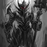
I got close to you but it was more streamlined armor, with a few spikes like on the pauldrons and such.
I feel like the mask would have teeth looking marks on in cause it says that he can make the mask look like a mouth and smile and bite.
This is good for the OG Harbinger. Tho after the multiverse evolution i got the impression that he has basically no spikes anymore unless he molds them. Just like bulky but almost just looking like metal skin aside the helmet
his appearance
Is this your appearance as the Harbinger of the cataclysm or as Living Dimension?
You keep writing about the way the armor grins or bites things, might wanna have the face plate reflect that.
Or smaller/ thinner. But only slightly. 3 his upper and lower body are ok for a human not in armor. But since he wears armor there should be no cola bottle thing going on. 4 the spikes on his armor point towards him, which makes them dangerous and removes any utility they might have. They should face either up or outwards for shoulderslams
His eye slit should be vertical, not v shaped. Unless his eyes are v shaped as well. The armor on his left legg is thicker than the one on his right legg, although it is supposed to stand further back. Either same size for facing us or smaller is needed.
Holy shit Daniel got buff for this one.
ah i see you dont want to have to redraw the hole thing well never mind lol i thot that was the same as the first one any way with that in mind 1st i was wrong about the pink thing was more thinking about the 1st pic 2nd put a rune on the hand its like a blank slate there 3rd the left foot hill is a bit of a mess i would just have the foot forwards
i can hardly draw a stick man but i can point out all the flaws so 1st his right hand is bent wrong 2nd left leg is not portioned right 3rd have him look forward or up 4th less pink more purple 5th his middle is what needs to be wider not the legs or the chest it just seems that way i no you want him to come off as not fat but look at any armor set u said covers all his weaknesses but you got his gut wide open 6th a bright back ground or bloody so you can make the energy darker
The cover version was made by a very talented and well known artist. He worked for riot games on some of their splash arts. I didn't hire him, I just got his permission to use the image.
I agree. I always thought it would look like plate armor with no seems that can flex like a fabric
I actually prefer the cover version
That’s really well done, I kinda imagined him as a more plain old Armour suit than what’s shown, but that’s a really good image to have, thanks for all involved
I like a lot about this picture, but he still seems a bit over-designed with the spiky bits on the shins, thighs and chest
For got to add. My thanks to the author and artist. THANKS!
I can see why all the people at the camp are intimidated, damn good job with Daniel.
Now there's a man who I wouldn't mind taking my lunch money!
*Cpy pasted this response from a comment above yours* I like it this way because it looks like he could really take a hit. It's like the armor's molded over that weakpoint, turning it into a strength. That's just my opinion though.
I like it this way because it looks like he could really take a hit. It's like the armor's molded over that weakpoint, turning it into a strength. That's just my opinion though.
I was of that opinion too. It's a stylistic preference.
He needs a neck, It looks like he would have to move like the old Batman's.
So much better. You should open up more space whete his mouth is, just so one can imagine the evil smile he sometimes does with his armor.
It needs to be able to smile evilly.
Awesome. :)
Nice, but where's his neck.
I've had a version in mir head consisting of Gantz (Berserker) and the Hulk Buster. The smile would be akin to the gnashing of the wolfs armor
but does anyone know how in anime and manga up and down lines showed weight or overpowering strength? like the very air is warping? i feel like that could be used here
perfect
Yeah a picture of Daniel mid fight with his armor morphing in different ways simultaneously would be cool. Although that would sick for the artist. Fight scenes are hard to dipict. Try drawing all parts of a human foot in a comic strip dipicting walking. Trust me it's hard as hell. Now imagine epic fight and all the strange shapes and movements involved.
Dear Schema! Now that is one sexy metal clad beast if I've seen one!
Yeah, widened shoulders was pretty needed. I’m just not sure if it was enough though, in the story his hands stop touching his sides a while back, so I can only imagine the gap gets even bigger as time goes on. Also, not really a fan of the head spikes, and just like everyone else, I always imagined a creepy jagged smile on him whenever he got super into a fight or something, so I’d definitely like to see that. Don’t mean to bash the picture, it’s frickin amazing, better than anything I could ever make, just a couple touch ups
Much better. The top center helmet spikes don't add or detract from the picture in my opinion. It simply depends on whether you want him looking spiky or blunt. Bulking out the legs and widening the shoulders improves it significantly.
Better but the creepy smile is a must lol
Badass
Still think the spikes on the helmet should go entirely. Make room for a creepy smile.
But the monster smile! THE SMILE MAN! THE SMIIIIIIIIIILEEEEEEEEEE!!!!!