finalbossblues
patreon
Hello! I hope you've had a nice week. Today I'm happy to share some new icons with you.
I've spent most of this week working on a small project for a game jam. If you've been a patron for a while, you've remember that I try to participate in a jam once or twice a year-- it's a good way to keep yourself motivated and always learning new things!
The game I'm working on is a short atmospheric platformer-adventure with some light potion-crafting. It's a small idea, but I'm worried that it might be a little too ambitious for the time frame of the jam... well, that's nothing new!
It's going to be called...

Of course, because I've put so much time into this thing all week, it's been hard to keep up with other things... but not to worry-- as usual whenever I participate in a game jam, I'm happy to share the new assets that I've created for the game!
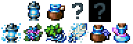
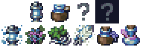
Today, that means I'm sharing this little set of item icons:

In my game, these icons represent:
The Twilight Lantern
Aurora Moss
Spidersilk Fern
Mist Feather
Spider Potion
Flight Potion
Of course... you're welcome to use them for anything else that fits your own project!
Note that the sheet also includes a couple small bonuses-- a lantern variant (without the aura) and some "?" icons -- always useful for the locked slots before the item is obtained in game.
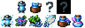
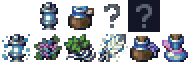
I've gone ahead and also recolored the sheet for Time Fantasy users, so they can fit into that style as well. The sheet is arranged in a simple grid so you can easily add them to any existing set:
Downloads - Full Colors (Elements Colors)
Downloads - Time Fantasy Colors
I hope that you can find a use for these.
------
Okay-- that's it for today. I'll be back next week with...
Well, here's my plan:
Earlier in the week, I asked if we wanted to continue with the Summer of Monsters... and it seems like an overwhelming yes!
So I'm proud to announce that the Summer of Monsters will continue for one more month. You can expect four more weeks of Monster Mondays!
...starting on the first Monday of August-- so not next week. 😝
I'm taking off this weekend to focus on the game jam-- honestly it'll be a much needed change of pace to refresh myself before returning to the monster-heavy schedule for the next month.
So you can expect that next week's post will have the playable Twilight Lantern game (if I can get it done before the deadline... *gulp*!)-- before the usual end-of-month stuff in the mid-week. And then back to the Monster Monday schedule when August begins after that.
See you soon. Have a great weekend.
Thanks!
Usually you want to use as few colors as necessary to make use of the contrast, but also need enough smoothness for readability without making things look blurry-- I think that part depends on the individual style.
How many colours do you think a 16*16 icon needs to look good without looking crowded? And does that change when you upscale it?
🙈 maybe the week after
Yay! Kobolds next week?