BlaiseCorvin
patreon

#soundslikeaplan
#imworkingonit
All this art is nice, but is there a chance of a new chapter soon?
Well, she still has this drawing to finish and 4 more to do...lol. I will pass along some of the critiques today, though.
Ya... I'm voting for artist number one.
I didn't say it wasn't functional. I said it looked stupid :)
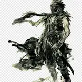
There is something off about the face it seems a bit too gentle and a little efeminate, because the lips are too big and the way it looks is ....arrogant but not the "I am a baddass orb bonded and can kick your ass" kind of arrogant more like "i look better then you" kind. Now the good part :) weapon looks bad ass :D , but the way he holds it in the picture is better for a sword rather then an axe/club/mace
How connected to his Asian heritage IS Henry? Would he have Asian style overlapping plates?
There is actually a reason for flared leather, it rebounds and offers more protection. I've seen more than a few manly men squeel like babies because they got hit on their "cool" armor.
Oh I thought that was like a visual "TahDah!" But now that I look again I notice his shorts are outside the armor which is a neat touch for armor that emerges from the skin. I'd love to see a variant with tattered clothes falling off or spikes just kind of glommed onto his bronze breast plate.
I think the spikes coming out of his back are supposed to be his steel spikes. I dunno. I kind of told the artists to do what they want. I have a 3rd artist doing all this stuff soon too
That might be a cool talking point if Henry was ever to use his armor in front of a blacksmith. "Your armor... Shouldn't work." Henry: "Dark Steel is cool."
I assumed this was a take on the Dark Steel armor. The only thing that threw me off on that point was the complete lack of spikes.
To cartoonish I guess
The only armor he actually uses in the text is a bronze breastplate and his steelskin too.
First reaction: love it. The look on his face... Screams "This bitch...". The weapon is functional. The armor is missing some leg coverage and the shoulders are good up to the shoulders. Those plates near his neck are not functional. I've tried em, don't work. They impede any arm movement above the shoulder.
I tend to agree (I mean, he is my character), but I was looking for different artists interpretations. This artist is female. If more people chime in, I will pass these along.
Think more iron man, than midevil knight. also, if you have skyrim for the pc or xbox one, try some weapon mods for the mace. Ive seen some cool ones that could be adapted for a METEOR mace(which is the coolest kind of mace in the world) It should look more epic.
well the armor is all wrong. I would love an excuse for armor flourishes now that he has dark steel. Henry is a manly man and would never wear boots like that. If you want some flavor over the shoulder look at the Irelea League of legends model. But henry is a demi god, who is cool with drag, but he is still a manly straight guy, IMO. The quality is def sub par to the last artist.
not a fan. Get back on artistbroker, and make henry great again!
If you have specific complaints, I can pass them along if others agree. I mean, this is why we do this. :P
Different artist. This is artist 2.
the weapon is fine. Though not as cool as i imagined. Its the everything else that kind of makes me throw up in my mouth a little... Is this the same guy that did adoh? The face is great. Its the everything else that i hate