JRMathews
patreon
I can also make a few more color adjustments one way or the other if people have feedback to give.
Image 1: Warm
Image 2: Mid-Blue
Image 3: Blue
Let me know what you all think!


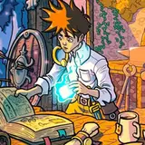
Although all of them are attractive, I lean toward the warm palette because (to me) it reflects Jake’s feelings of home, sanctuary, and creativity. The gold window background really stands out.
Warm for me as well. I also just became Artifact level subscribers so how do I get to read JMM3?
Warm! Mid-Blue is great as well, but I think Warm edges it out. Gives a cozier feel