meg
patreon
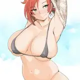
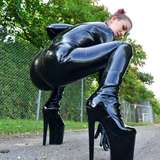
summer is upon us ~ just wanted to try and 1 up last year's kaina summer piece.
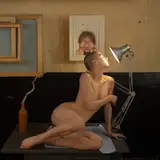
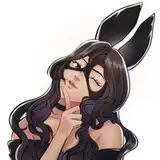
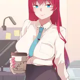
also im curious, do you guys prefer the more saturated recent stuff or the muted/dull colors i used to use? i honestly like both and curious what you think!


I like the brighter colors better... but it might need more of a palette shift between front and back. Smokin' either way.
I do like extra color myself, but agree with above. Also, I joined like a year ago, so I love the old style a lot too.
the improvement goes crazy
Both colour palettes are great, saturated is my preference but using both interchangeably is probably the best option. Depends on the vibe of the piece
The muted color was still good and unique. But I prefer much more of saturated color with more significant improvements
The muted colors are nice but honestly I love the saturated look of the new stuff the best ♡
Desaturated and muted colors is a call back to your old artstyle a few years ago but I look forward to seeing the new saturated colors in your new art.
Also, you definitely 3-upped your last piece. Crazy to think it's been a year since then
A good mix of both would be nice but if I had to pick one, definitely the color.
Personally a fan of the muted colors myself. Not to say either is better. I love both!
She’s fine asf
Big fan of the recent stuff tge colour work goes hard
I really like both. I always love color, but both are really nice and I'd miss the older style.