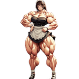
decisivedesire
patreon
How do you guys like having your names shown alongside my website? Do you think that is a cool reward for supporting me?

It's ok, I really do appreciate the feedback. It helps me with finalizing how things look on my end.
I'd talk big, cause it's a part of my job to design websites, but.... ugh, I hate my job, and want to quit, because I have no real idea about anything
Yeah, trying to get everything to fit on a screen is kind of an issue with working on a website, like how it is now the image can make the page scroll and I don't want that for my Home page. Still trying to get things to look good. The buttons on the bottom I don't think I can change the color to since it is buttons to go to other areas where people can follow Decisive Desire. I can see if they have something to fit it better. And the Patreon thing I can alter it and make it more appealing and go with the color theme.
Yeah, the thing between brown and purple is less problematic. It's just the colors to the left, on the bottom.. there's so many different colors, and that's disadvantageous the Patreon logo, the frame, the hear underneath, the icons in the lower right... if they all would go with the purple/brown theme.... and maybe white, white or black (or dark gray specifically) would be acceptable replacements.
I must not see the clash really, I'm using Purple since it's my main color but Don't want Purple overloading the site. The only thing I can think of to help is to get rid of the brown and change the orange Patreon side purple to go with the font color. If you have any suggestions or tips let me know.
well its looking... ok, but there's quite a clash of various different colors