companyman
patreon
I'm finishing up a video about how Nabisco is bigger than people may realize but I've been a little caught up on the thumbnail.
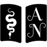
That Nabisco logo is just designed to be in a corner, so it kind of forces a product theme to fill the rest of the space. I went with Oreo because it's the most recognizable, but then I'm afraid it might make everyone think the video is mostly about Oreos (which it's not).
I tried putting in these red arrows pointing toward the Nabisco logo to draw attention to it but I fear they might be kind of tacky. What do you think? Better off with them or without them? They're both attached.
Or do you have any other suggestions about how to handle the issue?


I think your best solution might involve rotating, scaling, and centering the Nabisco logo so that it is the focal point of the thumbnail.
I agree with Jennifer in that I would be expecting something all about Oreo cookies, with or without the arrows. What about making the corner logo a bit bigger and then a sort of collage of photos of some well-known products. Nilla wafers and Chips Ahoy come to mind. Their official website (surprised Nabisco.com wasn't a thing) has a nice way of presenting all their brands: https://www.snackworks.com/brands?tabActive=all
I think this idea is great. No confusion with multiple Nabisco products and no whitespace. Win-win. (Nabisco in the corner, Multiple "main" products.)
Out of the two, I prefer red arrows. If this was my video, I would edit a few of their well-known products together in the thumbnail rather than just having Oreo. Very tricky situation as the logo looks weird by itself.
Oh man, I've never even seen that character before haha. It would probably look alright but I fear it's not recognizable enough. Might actually confuse people, especially since it's not addressed in the video. Unless he's more popular than I realize?
I know what you mean but that Nabisco logo pretty much has to stay in the corner. It just looks weird otherwise, so I need something to fill the rest of the space. Been really struggling with what to put there.
Very true. Only other thing I can think of is placing the old "Nabisco Thing" character from the 90s/00s on the image (I can't believe I remember that character)
Thanks Jon. I like the simplicity too, just worry if it conveys the right message. Maybe I'm overthinking it.
I hate to say it but I think you should leave Oreo out of it entirely? I would definitely think that's what the video is about. The red arrows clarify that a little bit but the fact that the Oreo logo is the larger of the two is what would be the attention grabber. But people love their Oreos so that could work to your advantage.
I think that just makes it look like it was cropped weird. And it would have to be a pretty extreme zoom before it's the main focus.
True, my bigger concern is that people will be upset and leave once they learn it's not about Oreo. It'll be clearly titled but I still don't want to mislead anyone.
Hmm maybe slightly zoom in to the Nabisco logo to emphasize that?
I like the simplicity without the arrows. Looking forward to the video!
That’s a tough one. I think with arrows is more informative, but Oreos will likely get the click anyway.