dgGenerator
patreon
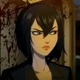
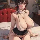
Different series mean different font, just like previous episodes i would like to get your feedback for the font that will be used to make sure it's easy to read, after looking at it im getting the sensation that the font may be too thin, but maybe it's more legible at size 18, i also was considering using bold for all the dialogs to keep a fairly small size but make the font as legible as possible all images font is at size 16 with exception of the 2nd, last image feature font size 16 with bold format


16
or you can find somebody, or more persons to do a audio, nwm im always like this
16
16
16
16
16