Theo
patreon
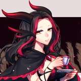
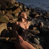
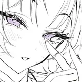
Here you can see the last of my ink commissions before my recent introduction of a new pricing system. They were commissioned by Tzerin (a wonderful artist himself) and a guy who goes by several names relating to cats ;) Catguy is how I call him!
My problem with inking has again been the process, and it led me to a chain of discoveries. While looking at the price sheet of a friend, I realized that there is always an increase in price when there is shading involved - I didn’t have that. It seemed that I’d set myself up a long time ago in a way that would let me decide from picture to picture if and how the shading was gonna take place, but that was wrong - too free, too vague, too much pressure on me. Shading or lighting is a whole step on its own. First you understand the form, then you decide on the light. And so my range of services would have to follow along, which resulted in me finally creating my first real style sheet. On the other hand, I also discovered that besides drawing and lighting, there are many skills to art that other people know far better than me. Both Matt Kohr of CTRLPAINT and Stephen Bauman (representing academia) have a great ability to break down large tasks into targetable skills.
For fun, here is a theoretical outline on how I might try to map out the process for a shaded “ink” style artwork. The goal here is to remain conscious of the importance of lighting as a realist tool to control accurately, while carrying over the aesthetic core of what I want to do with “ink-” going a bit outside the box, that is.
Coloured Shaded Ink > more representative goals due to shading
This shaded ink style makes you ask, but what about an unshaded one? Would it look very different? It could lean more into exaggeration, like some of my stickers do - but less funny. Or it could fall *flat*. Ha. The unshaded ink style might become very fun to do in a shorter timeframe, but I will need to use ink more in both a traditional and a purely digital way to really understand what that could mean, and to make sure that the skills I need to practice this style dovetail with the rest of my direction, and that I don't end up just offering another weirdly half-shaded style that doesn't know what it is. If I can't find a way to do a really cool unshaded ink style, it's going to go on the back burner until I find the time to dig into it.