WILearned
patreon
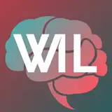
Y'all brought up a lot of great points in my last post about whether I should change the channel name so I'm sticking with it. However, the logo does need some work and you may have noticed that I've updated it. (Youtube is kind of weird with updating the thumbnail so maybe you haven't seen it - for me it shows up when I'm writing a comment, but not on my channel and not on the creators app)
Soon, I'll hire someone to make something that looks more crisp and professional, but for now I'm trying to make a decision on one of the two:
#1 - What the logo is now:

[At first, I thought the cursive writing made it look nicer but a little too fluffy - Like it would make people expect that my videos to be narrated in a soothing tone of voice, be backed with masseur music or give relationship advice. Though, it's grown on me and I prefer this one atm]
#2 - Other version

[The times font gives a more "No BS" vibe which is what I try to shoot for with my presentations, but it seems a little angry/boring/ dry. It is a lot easier to see as a thumbnail.]
I'm with Nu. The lamdsa gives it a nice look :)
I kind of like the current font. Like others have said, sans serif looks better. Just change the A to an L. The first one could still work if the I and L were clearer and easier to read. I thought the L was a British pound sign on the first one.