WILearned
patreon
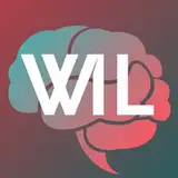
I got a lot of great input last time when asking about the logo. It seemed like visibility was a big point and, the cursive one I currently have is hard to make out - especially when viewed as a thumbnail. So, I've come up with something sharper. I'm going to with one of the three below - would be great to hear what y'all think:
#1 (My favorite, but not as good contrast on the letters when small)

#2

#3 (Seems to have the best contrast when viewed as a thumbnail)

Also, please take a moment to look at them when they're smaller, as most of the time only a the thumbnail will be seen. (See attachment, looks like patreon will allow only 3 inline images at a time)

I agree about the W-I spacing, as well. I also question the use of the "Volkswagen-style" W - seems too 'busy' and the letters don't "pop." You could even question the brain symbol - makes for a logo that seems to 'busy' - both old and new logos have this issue. I'm no graphic designer, but once dated one, and she was all about "pop" - making your message just jump right out there.
I agree with Alessandro Fazio's pbservation about the "W" and "I" distance making it a bit confusing.