cheyenne barton
patreon
EDIT: it appears that bright blue has won (just barely)!!! that'll be the one that shows up in the thumbnail on insta, but i'll probs post them all in a carousel, so peeps can check out the other versions. thank you so much for helping me decide y'all!!
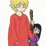
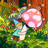
hi friends!! So I drew this piece last night, and I can't quite decide which colorway I like best for the leaves so please help me choose D:
1. bright green

2. yellow green

3. bright blue

I'd also love your feedback on if I should change the background color or not?? I'm trying to stop using just pale pinks and yellows for backgrounds ahhh so I think a rich cobalt blue is a good direction
Let me know what you think!!!
I wish I had seen this poll a day earlier but oh well. Cheyenne, this is some of the most gorgeous work we have ever seen from you!!
Darn just missed the poll
Definitely bright blue or yellow/green!
I can’t really put my finger on what it is about that bright blue but it just feels like magical forest vibes, if that makes sense 😂☺️✨
Was really torn between the green and the blue. Really torn.
I usually go for autumn yellows/greens but something about the bright blue is magical!
Love them all🥰 ! I chose the blue because it was such a delightful surprise🥳
i know if it were october if say the yellow leaves but since im craving spring and garden season i think the green looks really inviting!!
Actually now I’m gonna say blue because it allows the warmth of the sweater to pop more for a better contrast!!
Don’t mean to add to the confusion but have you tested out a purple/pink version?? Maybe more on the warmer side? That might look really cool!! Otherwise, I’m having a hard time picking too 😅
LOVE the cobalt blue- the yellow green is a nice contrast- but I agree with Pamela- blue does feel magical ✨✨✨
I think the yellow leaves with the blue bg is really nice but the bright blue ones do make it feel ✨ magical ✨
This might sound odd, but I chose the yellow green over the blue because it made the piece feel more pensive whereas the blue makes it feel somber to me. Probably just me being weird, though. (But I think all three are awesome)
love all of them but the bright blue makes everything feel more ✨magical✨
i choose yellow green bc it blend in so well with the character but not so much with the bg (i would say a more greenish/orangish bg?) but the bright blue is also very beautiful and matches the bg way better
I love the blue and the green, I can’t decide 🤷🏻♀️
Ditto to what Nadia said. It’s gorgeous.
I think the bright blue with the dark blue background is my favorite one!
You can try the old trick of putting the image b&w and see which one has better contrast too, I like the second option with the yellow green leaves tho :)
you know, i said yellow green but looking at it again i think it blends with their sweater a little too much. the green makes the leaves pop more (just my opinion). personally, i think i’d actually choose green not yellow green
they’re all SO stunning but I love the yellow toned ones and the way they compliment their cardigan!
I think the contrast of the green looks the best. You could do the blue with a different background color?
oh my god this is gorgeous !!!!!!!! i love the bright blue !!!