cheyenne barton
patreon
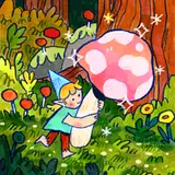
 hey y'all! I'm working on a new set of desktop icons for all my paid patrons, and was wondering which style you like better -- do you like a really clean/graphic icon look, or do you prefer something a lil more organic/sketchy looking?
lemme know how you feel! you can choose both, if you like~ the icon set theme is gonna be like all the items you might find in an adventurer's pack, along with some standard icons, such as folders and the like :o) I'm excited to work on it, it's been ages since I've made smth like this
EDIT: okay an additional question -- there's no poll for this, so maybe leave me a comment if you feel strongly either way, but do you like the subtle drop shadow or no drop shadow? they both have their charms....so I'm torn....


i love the shadow !!
I like the version without shadow better, gives a cleaner look
ahh i second this actually!! thinking about it more it makes a lot of sense, def something to keep in mind !
no drop! 💪🏼🖤
oooo this is also an excellent point -- i recently got a really cute felt pack, and I enjoyed the tiny shadow that comes from the scanning, but I get that with digital stuff the lack of shadow is more cohesive. thank you!
I prefer no drop shadow because I actually have so many of these desktop icon packs from you and other artists (and LOVE them, love getting more), and none of them have shadows. I love to mix and match my icons and refresh them often, so don't think they would blend as well with others if they were the only ones with a drop shadow.
ohhhh that’d be cute !!!
I think that in the case of desktop icons a drop shadow is not necessarily doing much to the design. Especially if we have busy backgrounds, it took me a while to spot it tbh.
I like no shadow better. If you want it to stand out more from the background, I almost think I’d like a bubble outline better though, like the type you make when you’re designing stickers.
I’m partial to no shadow (purely because I like to make my desktop and Notion icons match and they look better flat in Notion imo hehe)
Shadow or no shadow ... I think you've already shaded it in the drawing? So I'd say you don't need the shadow. But let the comments decide haha!
I like the dropshadow it helps it stand out from the background! It's so cute 🥺
Second one
Shadow!
I like the drop shadow!
Both are cute but I like #2 better!
sketchy for me! both look great though ^_^ can't wait to see the results!! finally will have a reason to stop putting off customizing my desktops eeee edit: with drop shadow for me too! def helps it stand out a bit more :-) both look gorg regardless
For Me is second
One of my favorite aspects of your art has always been the texture you put in everything so def that one for me!! Both are good tho!