TheofficialPIT
patreon
In few hours I'll be putting up a single charged post for next month. I'll definitely be catching up now that I've been cutting back on adding things to the list of things to do. It might also mean there will be less free stuff like random pinups and animations from me. I'll go over the list of things I plan to finish next month when I post later.
~Peace~
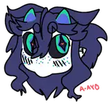
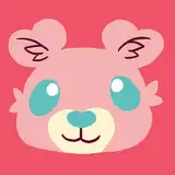
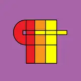
P.S. Let me know what you think of my test logo.

Damballah is fast becoming a favorite...I hope we get to see all of the Coxville cuties on the island at some point....maybe a huge IR gangbang. Hell, would be even better if Jen & Jane Herron showed up as well, and Vivian Whiteside & her daugher too...could be all of Pits girls in the same place, including the Bimbo Bomb Girls (Buttercup, Blossom, & Bubbles) Just my thoughts!!!
I really love these Damballah updates. This is definitely one of my favorites. The narrative is over the top and makes this so bad-ass. I heard "Harold" paid for the girls to have a vacation together. I am so glad they are enjoying themselves. How awesome!!
Some thoughts: Including all the letters in the logo design would make it clearer. It would be good to easily see who the artist is by looking at just the logo. Current design is close to a cross.
Jus like yo hot momma bitch.. slaves fo massive ebony monsta donkey dick.. open dat mouf up.. get sum of dis dick!
Oh ok, thanks! :D
Sorry to be pedantic, but gotta ask. The 18 inches, is that the amount he managed to fit, or the entirety of What he had to offer? Haha.
I agree. It's just a test though.
M-m-m-m-m-monster cock!!!
You have not missed it. It's still just in the sketch phase, save for a couple panels which were colored, but that's all so far.
Really dig the expression on the right panel, great job man.
Have to say the logo looks kind of cult-ish to me. Which, I suppose might apply to some of your fans, but I don't think it reflects your style and subject matter.
Don't feel bad man I kinda did the same thing except I kinda got a chuckle that there trying to be sophisticated and then words like ARM,BLACK,DONG or HORSE are all caps and bold font trying to make a statement.
I think your test logo passes.
Jenny can only be the Queen, if there is such a font.
Oh, and the fonts are very cool. I like that they are different which makes it more fun. The new logo rocks! <3
"Day One" wow it's been a ton of action for just one day. They must have been really starved. :O I like how we get commentary from both Queen and Princess, one describing what she sees and the other describing what she feels. =)
Is Hot Meal finished or on the backburner? Or did I simply miss it, that's entirely possible too. :P
Yeah, you're not wrong, it is a bit "tetris".
Jenny's font is very fitting as well. That's exactly how I would imagine her hand writing to be, Sophisticated yet feminine. While Kitty's font kind of looks like she wrote it while getting some dick at the same time, haha. I can see Kitty with a bit of ADD but in a cute way. Ok...I'm analyzing these fonts way too deeply now.
It's all top notch PiT!
Logo's pretty clever actually.
Absolutely amazing as allways :D Love the Summer girls and love your work!
Lol love it man, and also love the logo!
Just upgraded my support to $5. You deserve it man. I like the new Pit.
Heheheh simplistic and clever on your new logo. Still, Kitty as Princess...I am wondering what Jenny fills in...XD
Tetris eh... Not bad~