nottravisgames
patreon
I know, I know. I said I was taking some time off. And I will.
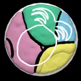
But I was thinking about a logo of some sorts. Something simple but that would allow a bit of product recognition.
You can see a mock up above in the right hand corner. Thoughts?
Edit: Alrighties guys, taking the rest of the year away from the interwebs. I'll keep nursing the animations along but that's it. I promise I will take a break :)

I agree with a color adjustment on the "nottravis" to stand out better. I can also see the "nottravisgames.com" in a crescent riding the under the under the "N" logo. Okay that sounded dirtier than I intended.
Yup, I think you're right
Yummers
The black text on fuchsia is kind of low contrast. Maybe a different color?
Usually it's the brunette giving the side eye to the blonde bombshell. Hmm...
To make the Nottravis text more legible, you could use a lighter purple background colour.
I think it's pretty unique and recognizable. If I ever see that n with a pink background, I'll know who made it.
A lot of other game designers have logos, as do a lot of games, so it’s certainly a good idea. At the very least it’ll give someone a clue to put into Google to find you.
Oh a while yet. I think I'd want it in place for end of January tho
How much time do we have left to ponder the matter ?
I actually think the overlaid text is almost necessary. That way anyone not already following the game that sees the image can just google "nottravis" and be more likely to find the game. Overall I like the design of the logo, eye-catching but not obnoxious.
I like it, but I think I would prefer the logo without the black-overlaying text. So without the "Nottravis" bit. Just the N on the pink/purple background inside the white and black circles should be enough.